Archive
Branding

There are precious few companies in the world that have experienced the kind of explosive growth that Facebook and Google have enjoyed. And of those few companies, the vast majority have a silicon valley area code. Given all that, you might be surprised to know that in recent years a food manufacturing company based in upstate New York has experienced growth that even Facebook and Google would envy. That company? Chobani.

In case you have been avoiding the supermarket for the last decade, Chobani is a Greek-style yogurt that has taken the world by storm. As a recent CNN Money article states, the growth that Chobani has experienced “is unheard of, particularly for a startup, in the packaged-goods business—and rare in the tech world.”

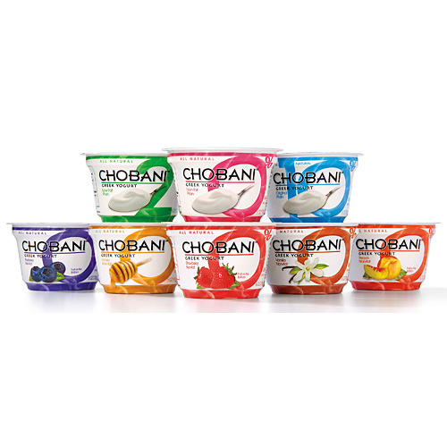
That being said, this company’s success clearly has a lot to do with (as most often times it does) the person behind the brand: Hamdi Ulukaya. In 2000, Mr. Ulukaya borrowed $1 million to buy an 85-year-old yogurt factory in upstate New York. Five years after selling the first case of Chobani, the company reached $1 billion in revenue. Mr. Ulukaya has always been the 100% owner of Chobani, and has used an innovative business model that is anything but a corporate one. He doesn’t believe in customer research, as all feedback from the website goes directly to his BlackBerry. He doesn’t value one employee over the other – he values the person who answers the calls just as much as someone in the purchasing department.

What’s more, from the start, Mr. Ulukaya has and continues to give 10% of Chobani’s after-tax profits to philanthropy. His motto? “Nothing but good.”

To read the CNN Money article, click here.

Read More

After soaring with the same logo since 1968, the nation’s third largest airline, American, has recently unveiled a new logo that will appear on planes by the end of January.

New York based Vignelli Associates created the airy, simplistic design you see here.


The new logo still consists of red, white and blue undertones, but now features them as lighter and brighter.

American has also decided to update their alternate typography logo. Notice that the new version below has a more refined font in a solid color, a good symbol of unity, considering the words in the old logo were split between red and blue.


Old Logo


New Logo


Some elements the brand did keep the same though are American symbols like the eagle and flag — reflecting the airline’s “passion for progress and the soaring spirit.” The new logo also creatively and simplistically introduces some new American motifs that were not in the old mark, such as a star, the letter A, and a runway.

We think the airline will do well with this new logo and re-branding, as it now reflects the times – it’s modern, but still remains recognizable and true to the airline’s core beliefs.

Read More

Ta Da!

If you weren’t lucky enough to have received our 2012 Holiday Package, here is a glimpse of what our clients received in the mail or by hand delivery.

These all-natural carrot cakes (courtesy of Donna Hutches) were baked in 4 mini jars, and placed in a carefully designed package—complete with individual wooden spoons (for sharing) and a hand-stamped logo on the lid of each of the jars.

Nestled in an embossed box and wrapped in a letterpress belly-band, these cakes are as much a joy to open as they are to eat.

We’re proud to show off this latest brand identity we created for The Cake & Carrot Company (C&C) ….and yet, our clients and friends were equally (if not more) thrilled to have received them!


We had a very short timeline in which to have this packaging completed. We’re very grateful to the vendors that we worked with to get each element produced with such time constraints. A Quick Cut, of Maple Shade, NJ was able to turn our custom dieline into a functioning and beautiful box, stamped from Neenah Classic Crest stock and then embossed with the Cake & Carrot Co. logo and crest.


The belly-band was produced by Colleen at Cleanwash Letterpress on Frankford Ave. in Philadelphia. Printed on French Paper’s 100 lb. Construction Line stock, she was able to achieve a nice impression that really brings the branding to life. On the day the cakes were baked, we hand-stamped the date on the bands, adding a personal touch.


The holiday card and production notes contained within the box were digitally printed by our friends over at Garrison Printing. We were kept plenty busy while these elements were turned around to us. Debossing the C&C crest into each steel jar lid proved to be quite a challenge. Using a custom ordered aircraft-grade steel stamp, we found that we needed 12 tons of pressure to get a clear imprint. With each lid needing to be stamped individually while operating a modified hydraulic press by hand, Eric’s weekend was pretty much spent in his garage.


We were relieved when all elements merged seamlessly to create the finished product! As we work to expand upon the Cake & Carrot Co.’s brand, and to help get these treats to market, be sure to visit thecakeandcarrot.com to sign up for updates, or visit the brand’s Facebook page.

Read More

Wendy's Logo, Before and After


Wendy’s was fist opened in 1969 and has undergone only minor updates to it’s logo since. Last week, the third largest fast-food burger company rolled out a refreshed logo after the previous one stood for nearly thirty years. While maintaining much of its value when it comes to the pigtails, the company has chosen to move away from the antiquated typography and to move toward a more modern and inviting hand-drawn type. Although the execution leaves much to be desired, its evolution and purpose is clear: to appeal to a new generation of customers with slightly more sophisticated palettes who tend to be more calorie conscious. Reflecting these values, Wendy’s has also released their vision for an updated restaurant experience, seen below.


Looks like we’ll all be eating our Double Baconator in relative style.


Read More

Can you guess?

Microsoft! On Thursday, Microsoft revealed its first new logo since 1987.

The new logo has two components: the logotype and the symbol. For the logotype, the font is Segoe which is the same font that is used is their products as well as marketing communications. The symbol is important in a world of digital motion. The symbol’s squares of color are intended to express the company’s diverse portfolio of products.

Its simple, easy on the eyes and the symbol plays into the uncluttered look as well. What do you think?


Read More

Even though summer is at its midway point, Pepsi NEXT releases two new flavors to celebrate summer. These two new flavors Cherry Vanilla and Paradise Mango will only be available this season from July 15th through September 8th. The new additions are true to the Pepsi NEXT brand in being low-cal drinks with real cola taste and 60% less sugar.

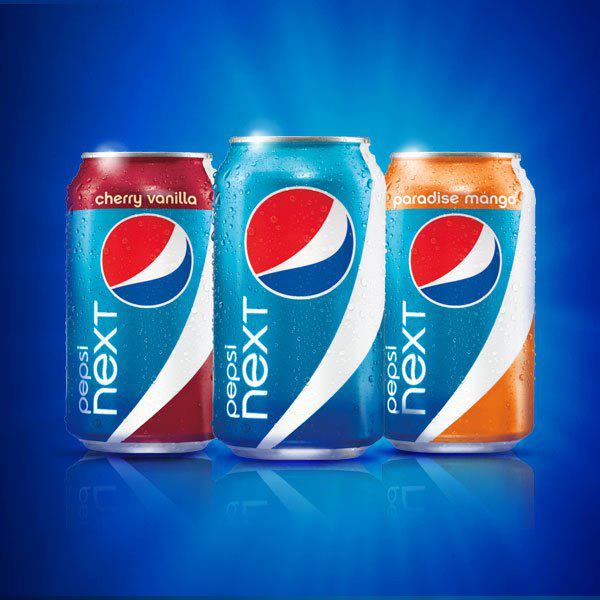
Paradise Mango has a tropical twist, while Cherry Vanilla is a mix of traditional tastes served in a new way. They even used actor William Levy, (who was named the sexiest man of 2011 by People en Español) to present the product at The Americana at Brand in Glendale, California.


Read More

When I see that big companies making limited edition cans or products, I always think to myself, “Why don’t more companies do this?” Granted, that is not to say that all items are designed well or look great, but I find it more appealing when companies switch it up a little. Why not give your customers something new to look at?

Throwbacks, limited edition, and holidays are just some of the reasons for a packaging switch up. Here is an example, Coors Banquet Beer. I know these cans coming from a family that loves banquet beer so when I saw these, I was more intrigued.  I read a little more about this on the Dieline:

The Coors Banquet brand is built upon the legends of its timeless western spirit, from miner banquets to it’s high quality ingredients. We celebrate the Banquet Beer’s rich heritage with the release of four commemorative can designs selected from the brewery archive. The cans represent the 1930s to 1980s, and are a testament that Coors Banquet is Golden Forever. Born in Golden, Colorado, Coors Banquet has stubbornly refused to compromise since 1873.

As you can see they have stayed within their brand since the beginning. Isn’t it nice to pay a little tribute?

Read More

On the W we always talk about big brands and big changes. What about the in-house brands or smaller mom and pop shops? Today, we are featuring a private label package re-design from Publix.

Not only did they re-design their package, they thought ahead and made an entire system for their products. This system provides consistency and reinforces their brand. For their candy in particular, their approach here gives consumers what they want–simple, cut to the chase packaging but in a playful yet simple way AND a window to see the actual product.

Personally, I think that the use of color is awesome. I love the fact that the product windows are of a different shape depending on the item. Although each package is not identical, through their use of identical logo placement, color blocks and fonts there is enough brand awareness. It goes to show you that just because it is a store brand, doesn’t mean they were skimping when it came to design!

StripySweets New

Sour Worms


Read More

As I was browsing the Dieline, one of our favorite sites, I came across this article.
I was intrigued to view the opinions as well as the visuals to go along with this study. What if you took a brand logo down to its absolute minimum? Would it help or hurt the brand?

Guinness was the first that Mehmet Gozetlik of the design collective Antrepo looked at.

Some might work at this 4th most simplistic level because of the brand equity that has already been established.  Would you still recognize it in the liquor store? Chances are yes. The can, color and taste will be the same.

But what about M&M’s? It almost looks like their original packaging!

So as some may indeed work at the 4th level of minimalism, most would work best at the 3rd level. The 3rd level would be where the logo itself stands out on a colored field within or with a certain shape (such as Pringles). If you took the image away I am not sure that it would have the same impact?

Would RedBull get as much recognition? Sure the can is the same shape but it has lost its signature color scheme…what do you think?

To read the full article, click here.

Read More

Remember the last post on Mission Artisan Style Tortillas?

Not only did they launch that new line of product, but check out how they are continuing to keep their name out there and increase consumer involvement:

Mission Foods brings together its passion for tortilla chips, hard core football rivalries and nacho innovation as it announces the unveiling of NachoTron 3000 at the 2011 Border Showdown between the Kansas Jayhawks and Missouri Tigers on Nov. 26 at Arrowhead Stadium in Kansas City. This spirit of competition has reached a pinnacle as tailgaters will have the chance to show off their football throwing skills and team loyalty for free nachos made with Mission’s authentic Border Showdown tortilla chips.


RivalryTo boost pre-game festivities, Mission has released limited edition Border Showdown tortilla chips now available in stores while supplies last. University of Kansas Jayhawks bags include red and blue chips while University of Missouri Tigers bags include gold and black chips. Both Border Showdown varieties come in 12-ounce bags, each adorned with their respective mascot, and can be found at major grocery and retail outlets in the Kansas City area.

To view the full article click here

Read More