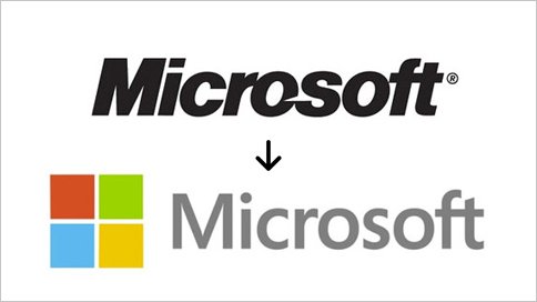
First new logo in 25 years!
Can you guess?
Microsoft! On Thursday, Microsoft revealed its first new logo since 1987.
The new logo has two components: the logotype and the symbol. For the logotype, the font is Segoe which is the same font that is used is their products as well as marketing communications. The symbol is important in a world of digital motion. The symbol’s squares of color are intended to express the company’s diverse portfolio of products.
Its simple, easy on the eyes and the symbol plays into the uncluttered look as well. What do you think?

