The “New” Factor
We’ve been doing our research. We’ve found that more and more brands are calling attention to their new look or variety by using the word “new” in various ways on the design of their package or product – in a bar, across a box, in a circle, you name it. This word has become so important that some brands are creating their entire design around it, others even going a step further and telling consumers what’s new about it on the design. Take a look below at the different ways and places you’ll see this word used on product designs.

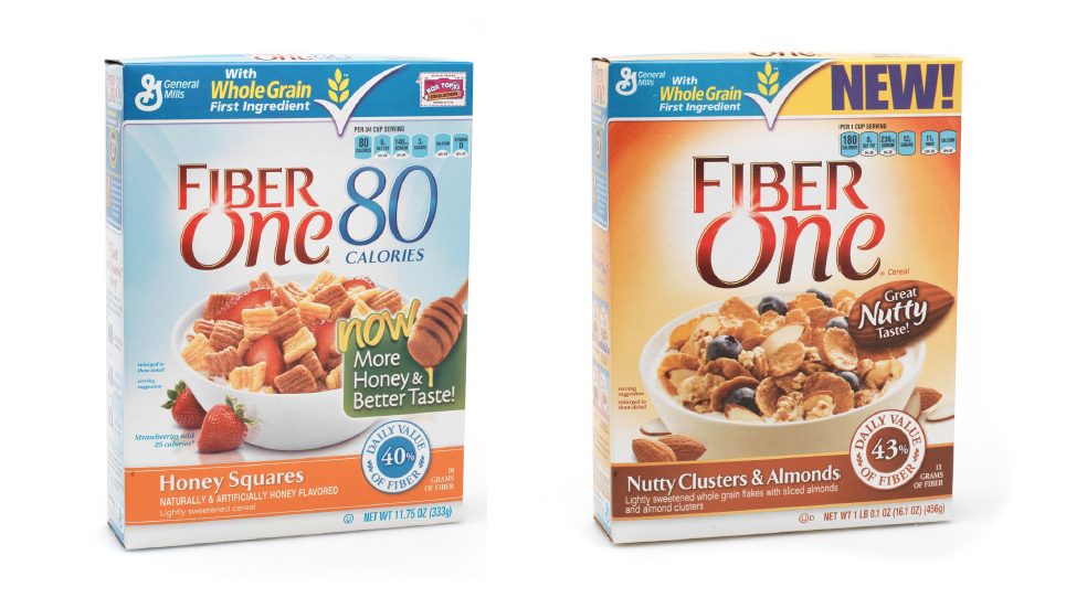
Some brands, like Pepperidge Farm and Fiber One are using what are called “basic interrupters.” This means that the word “new” is not affecting the whole layout and design on a product, but is just a small call-out on the front.
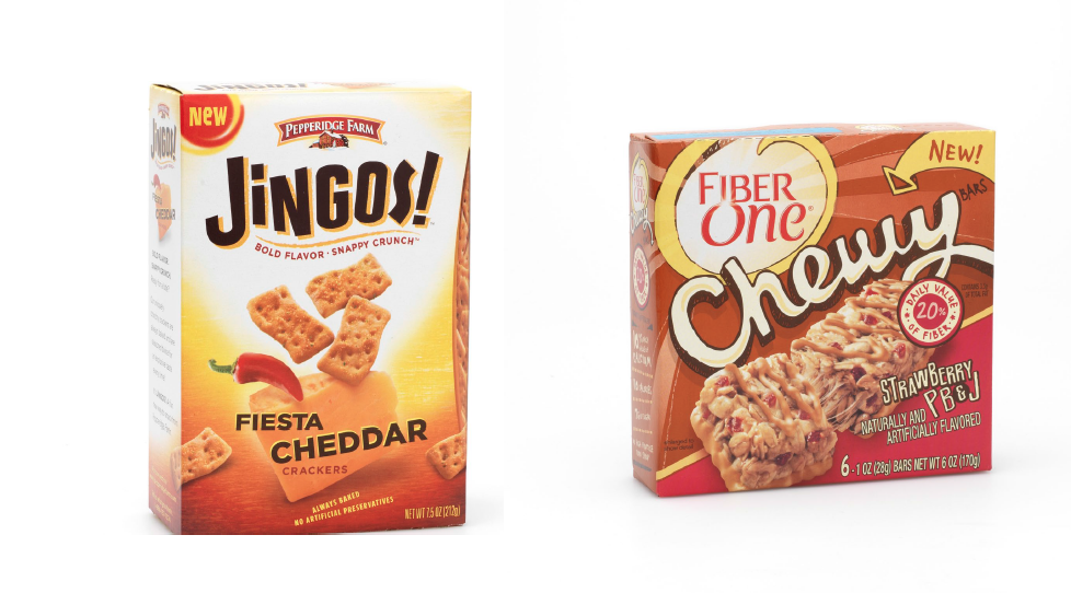
Here are more examples of basic interrupters:
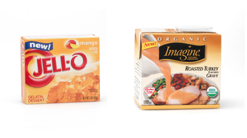
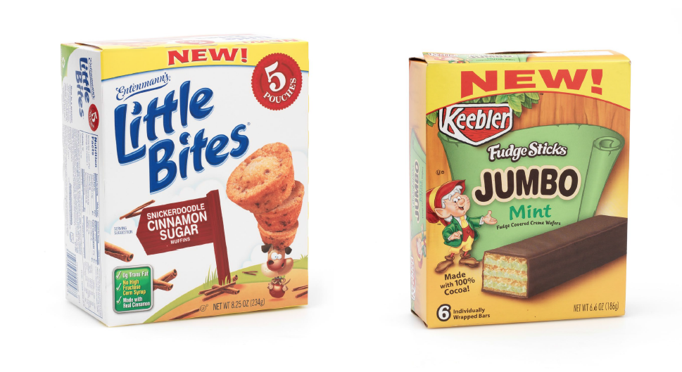
Here are examples of design altering call-outs. As you can see, the word “new” takes up the entire top portion of the boxes below, and utilizes a completely different color than the rest of designed box.
 Often times, when brands are creating a line extension or a new variety, they also want this called out by using the word “new.” Fiber One does this on the box design of their new Nutty Clusters & Almonds variety.
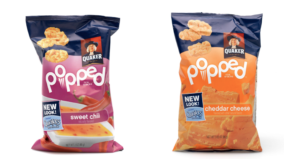
Still, many brands want consumers to know exactly what is new or different about their product, so they make sure to explicitly state it on the design of the bag, box or package.
Quaker wants consumers to know that even though the look of their bag changed (as well as the brand name), that the mini rice cakes still have the same great taste.
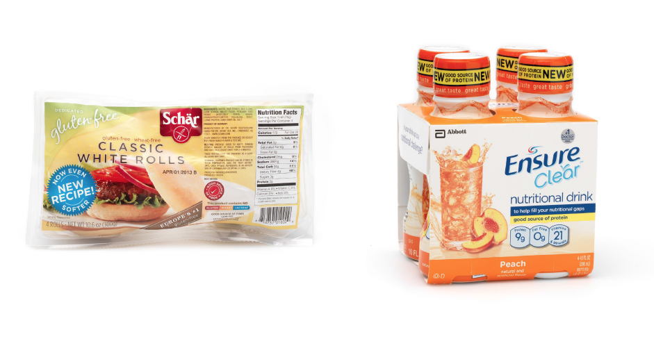
Schar however wants consumers to know that they in fact did make the actual product better – it’s a new recipe this time that they are using to create softer rolls. And Ensure uses two tactics. Peach is a new variety, but they still want to reiterate to consumers that the Ensure brand in general is a good source of protein.