
A New, Refreshing Side to Sesame Street
Toy packaging doesn’t have to be over-the-top. Sesame Street showed us that recently, with the simple re-design of their licensed consumer products packaging that is being rolled out worldwide.
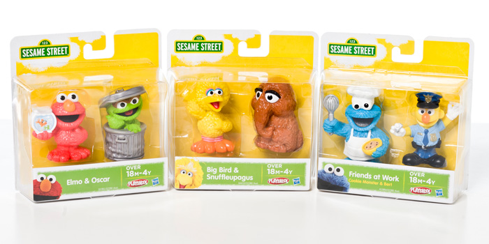
Sesame Street collaborated with the agency Parham Santana to fight against the cluttered toy aisles that are becoming overwhelming for customers (excessive images, messages and colors.) The brand was committed to defining itself by keeping their design simple, nice and cohesive….and by placing their most prized assets in the forefront of their designs – their characters. After all, these characters are what people connect with the most, no matter what or where people are looking, reading or watching. The characters are what sell, so why not sell the characters!
“Parham Santana discovered that it’s the instant, emotional connections to the characters that play out daily across countries, cultures and channels that make the brand so powerful. Whether it’s Big Bird or Cookie Monster, the Sesame Street Muppets instantly make connections with people. This essential truth guided the development of new unified packaging designs that make Sesame Street characters the stars at every brand touch point.” – (The Dieline)
This 43 year old brand is doing it right – they are going back to the basics, when everyone else is inundating their packaging with excessive designs. How refreshing.