Shelf Impact
When you walk into a store you usually have the low end or store brand, the moderately priced item and then of course the high end. Nowadays some of these products are blending together. Some of these house/store brands are even doing a better job on their packaging than big names! Here is a prime example: Cutex.
For years, Cutex has been a household name in nail care, but lookalike packaging by competitive branded and private-label products was beginning to confuse consumers. This confusion caused Cutex to lose market share. The worst part was that in a Cutex Brands survey, eight out of 10 respondents claimed they were buying Cutex products, even though sales share showed that was not possible. Can you believe it?
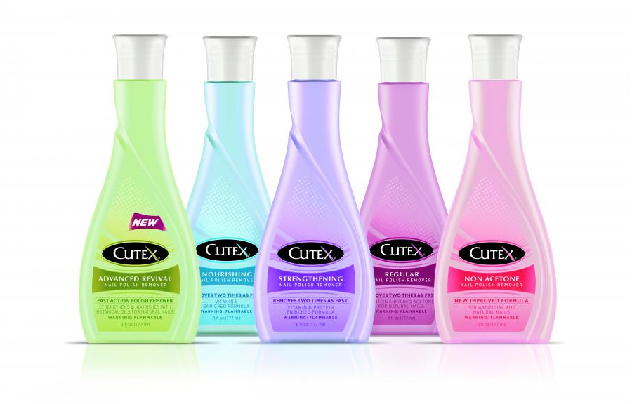
To reverse this cycle, Cutex decided that they were in need of an update, and needed to differentiate their package. While retaining the basic bottle silhouette to make the container instantly recognizable as nail polish remover, the design team made critical changes. Among the structural changes, the bottle height was increased which provides more visibility on shelf. Notice the cap. They replaced the standard, straight lined cap with a reverse-tapered closure which elongates the bottle and accentuates its upscale appearance.
 Adding femininity and a premium image to the bottle, a decorative, swan-like shape was debossed on its front panel. The front label was then die-cut in the same swan shape and updated with a modernized logo, softer graphics, and a lighter pastel-color palette.
What do you think?
