Archive
Packaging/Refresh

Ta Da!

If you weren’t lucky enough to have received our 2012 Holiday Package, here is a glimpse of what our clients received in the mail or by hand delivery.

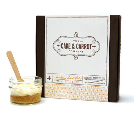
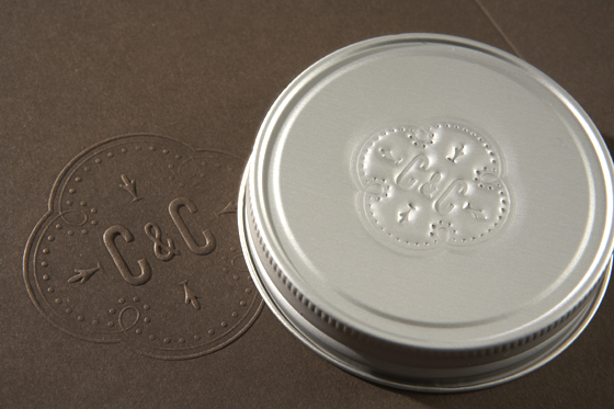
These all-natural carrot cakes (courtesy of Donna Hutches) were baked in 4 mini jars, and placed in a carefully designed package—complete with individual wooden spoons (for sharing) and a hand-stamped logo on the lid of each of the jars.

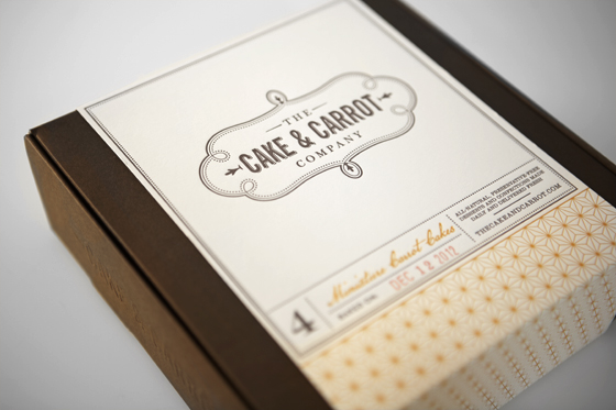
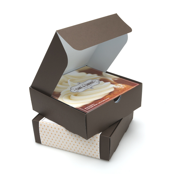
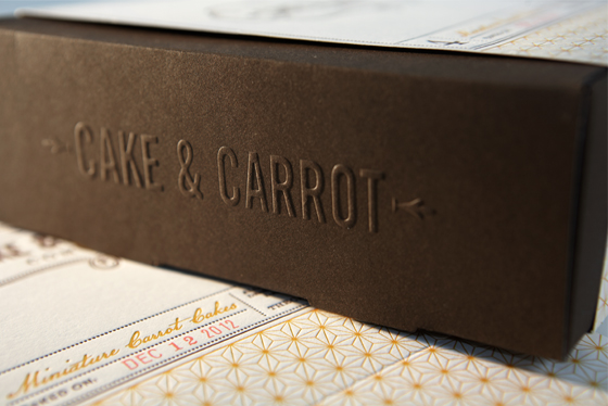
Nestled in an embossed box and wrapped in a letterpress belly-band, these cakes are as much a joy to open as they are to eat.

We’re proud to show off this latest brand identity we created for The Cake & Carrot Company (C&C) ….and yet, our clients and friends were equally (if not more) thrilled to have received them!


We had a very short timeline in which to have this packaging completed. We’re very grateful to the vendors that we worked with to get each element produced with such time constraints. A Quick Cut, of Maple Shade, NJ was able to turn our custom dieline into a functioning and beautiful box, stamped from Neenah Classic Crest stock and then embossed with the Cake & Carrot Co. logo and crest.


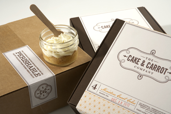
The belly-band was produced by Colleen at Cleanwash Letterpress on Frankford Ave. in Philadelphia. Printed on French Paper’s 100 lb. Construction Line stock, she was able to achieve a nice impression that really brings the branding to life. On the day the cakes were baked, we hand-stamped the date on the bands, adding a personal touch.


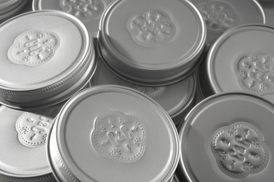
The holiday card and production notes contained within the box were digitally printed by our friends over at Garrison Printing. We were kept plenty busy while these elements were turned around to us. Debossing the C&C crest into each steel jar lid proved to be quite a challenge. Using a custom ordered aircraft-grade steel stamp, we found that we needed 12 tons of pressure to get a clear imprint. With each lid needing to be stamped individually while operating a modified hydraulic press by hand, Eric’s weekend was pretty much spent in his garage.


We were relieved when all elements merged seamlessly to create the finished product! As we work to expand upon the Cake & Carrot Co.’s brand, and to help get these treats to market, be sure to visit thecakeandcarrot.com to sign up for updates, or visit the brand’s Facebook page.

Read More

A lot of big companies right now are struggling with the private label competition. With the economy being down, many consumers are seeking the store brand/private label option to help cut costs and better manage finances.

If you are a frequent WalMart shopper, you are more than likely familiar with their brand “Great Value.” Their packaging is predominately white, has blue copy and a simple photo. But how about if I told you that the label below was “Great Value,” would you know?

Cott Beverages has gone through three different label designs in the last three years for its line of juices under the Great Value brand. This time, they opted to take consumers to “the fertile farmlands where the most delicious fruits and vegetables are grown.” (source) This approach allows imagery to do the work in illustrating that this great tasting juice begins at the source.

Compared to any other item under the Great Value name, this is definitely eye catching…but is it also deceiving? What do you think?


Read More

We haven’t looked at a before and after in a while. Let’s check out this new design from the UK’s leading independent producer of sugar confectionery and popcorn, Butterkist.

Let’s take a look here. To the left is the old design. The first noticeable difference is that of the color. They went from a fire engine red to more of a richer red, maroon almost. This rich velvety red is the official brand colour, and is used consistently across the product range. They offer a subtle background here to create visual interest as well as have re-vamped the logo and its imagery. This redesign is said to reflect Butterkist’s heritage and their long her association with the film world. Created in 1914 in America, their machine eventually made it to the UK in 1938. It is still popular today.

With such a prominent history in film, this new Butterkist identity has been designed to reflect the idea of a popcorn production company.  The theme is reflected through the introduction of the ‘epic’ popcorn Atlas symbol, and a chiseled-style Butterkist logotype. The cinematic theme continues with the use of different typographic styles to illustrate ‘film-like’ personality into the individual parts of the package which allows for differentiation between flavors and creates a platform for a wider range of products.

What do you think?


Read More

We all know that times change. People, places and things have to keep up with the times and constantly keep on their toes. Much like many of the other posts that have been written, we are firm believers in logo re-design/updates.

Since the Olympics have been kicked off, why not look at the timeline of logos?

Doesn’t 2012 POP?


Read More

When you walk into a store you usually have the low end or store brand, the moderately priced item and then of course the high end. Nowadays some of these products are blending together. Some of these house/store brands are even doing a better job on their packaging than big names! Here is a prime example: Cutex.

For years, Cutex has been a household name in nail care, but lookalike packaging by competitive branded and private-label products was beginning to confuse consumers. This confusion caused Cutex to lose market share. The worst part was that in a Cutex Brands survey, eight out of 10 respondents claimed they were buying Cutex products, even though sales share showed that was not possible. Can you believe it?

To reverse this cycle, Cutex decided that they were in need of an update, and needed to differentiate their package. While retaining the basic bottle silhouette to make the container instantly recognizable as nail polish remover, the design team made critical changes. Among the structural changes, the bottle height was increased which provides more visibility on shelf.  Notice the cap. They replaced the standard, straight lined cap with a reverse-tapered closure which elongates the bottle and accentuates its upscale appearance.

Adding femininity and a premium image to the bottle, a decorative, swan-like shape was debossed on its front panel. The front label was then die-cut in the same swan shape and updated with a modernized logo, softer graphics, and a lighter pastel-color palette.

What do you think?


Read More

Even though I have never heard of Lyons Cakes, their newly designed packaging caught my eye.

In reading more about the company in when they were founded and what they were about, the re-design I think will serve the company well. Take a look at the old packaging compared to the new:

The new design explores and celebrate the brand’s rich heritage. The new look rewinds back to its famous history of teashops and its waitresses from the 1890s. (see photo below)

With a long-standing tradition for ‘proper’ cakes, the brand was renowned for its nippy waitresses serving up affordable tea and cake to the masses. Having lost its way over the years, the redesign focused on communicating the brand’s story in a relevant and contemporary manner.

“The new design gave us a chance to transform Lyon’s, rediscovering the wonderful heritage that made the brand famous in the early 1900s. We decided to hero the nippy waitresses at the heart of the teashops to deliver personality & heritage, balanced with a vibrant colour palette to create a sense of modernity for the brand.” Laurence Hunnex, Senior Designer, jkr. (source)

Read More

There is nothing worse than looking at a package or product and not knowing what it is, or what it does. What ever happened to K.I.S.S? (Keep it simple stupid)

Take a look at Scotts new Snap Spreader System. Their new packages were designed to take the guesswork out of lawn care. The product line includes a spreader and specially formulated products for specific lawn care needs, such as controlling weeds, killing insects and fertilizing.

The idea behind this was to of course help consumers know which product would be the best for their lawn care needs. The design needed to communicate its key features and benefits loud and clear. Getting these benefits were wrapped around the idea of  ”A beautiful lawn is just a snap away.”

Take a look at the type face–it is very easy to read, modern looking and of course locked up with the existing Scotts logo. Notice the graphics and bright colors used on the “Snap Pac.” To correlate with each color is a close-up circle device which depicts the solution to lawn care. What makes the package work is that all of these correlate with one another including a blue sky on the upper half of the bag and vibrant green grass imagery on the lower half to showcase the end benefit.

Lastly, a three-step instructional inset of Snap, Lock and Go illustrates how simple it is for homeowner’s to use the lawn care system. Easy enough right?


Read More

When I see that big companies making limited edition cans or products, I always think to myself, “Why don’t more companies do this?” Granted, that is not to say that all items are designed well or look great, but I find it more appealing when companies switch it up a little. Why not give your customers something new to look at?

Throwbacks, limited edition, and holidays are just some of the reasons for a packaging switch up. Here is an example, Coors Banquet Beer. I know these cans coming from a family that loves banquet beer so when I saw these, I was more intrigued.  I read a little more about this on the Dieline:

The Coors Banquet brand is built upon the legends of its timeless western spirit, from miner banquets to it’s high quality ingredients. We celebrate the Banquet Beer’s rich heritage with the release of four commemorative can designs selected from the brewery archive. The cans represent the 1930s to 1980s, and are a testament that Coors Banquet is Golden Forever. Born in Golden, Colorado, Coors Banquet has stubbornly refused to compromise since 1873.

As you can see they have stayed within their brand since the beginning. Isn’t it nice to pay a little tribute?

Read More

Going green as we have said before is a common trend and becoming more and more popular. From the way things are made to their transportation every little part counts. Another company getting involved in the eco-friendly trend is Lactalis American Group. Lactalis American Group is the maker of Sorrento, President and other cheeses.

One of their brands, Precious cheese has a product called Precious Stickster snacks. This is their newest package to move to plant based packaging. The new packaging material was developed by Clear Lam Packaging Inc. using plant-based bioplastics derived from Natureworks Ingeopolylactic acid (PLA) along with ingredients that enhance performance.

According to Clear Lam Packaging, this new material, which is 50% plant-based, generates up to 35.2% fewer greenhouse gases and uses up to 36.8% less energy than the conventional petroleum-based materials it replaces. Lactalis made the packaging change as part of its corporate sustainability commitment. (source) Clear Lam produces the proprietary bio-based layer used in the film from pellets and additives, then that film is shipped to a Lactalis production facility where its Precious Sticksters products are packaged on horizontal form/fill/seal machines.

Early reports show the finished bags have a lower carbon footprint without losing production efficiencies or impacting product performance. High-speed sealing was a critical requirement. 

Read More

Of course, we are always fans of the package re-design before and afters. Gives us a chance to evaluate what worked before, what works better and whether or not we think the right choices were made. Granted, we may not be experts but hey everyone can have an opinion right?

Bolthouse Farms Yogurt dressing used to look like this:

Notice the transparent label putting all emphasis on the product. The brand hierarchy seems appropriate as well as throughout the product line, the color scheme that is has established. However, one of the key benefits of the product or one important thing to know is that its base is yogurt–which this package clearly states in the beginning of the read. Imagery here looks nice and fresh. 

So now lets go to the new package. Here they went from a clear label to a unique die cut white-looking label. The hierarchy has shifted in that the “Yogurt” ingredient call out is pushed to the bottom but looks to have a bit more presence and emphasis than before. Notice the additions to this bottle:
• Low Fat, Low Calorie, Great Taste burst at the top label
• “New” burst
• 45 Calories per serving burst
Although this is new and the die cut label is unique–what do you think of the over all re-design? In my opinion it looks like they took a step back in terms of the unique fonts, placement and the transparent label. Granted, the overall goal of this redesign looks to be to emphasize the health benefits and great taste which it clearly does. I think it works, I just may have to vote with the previous design. What do you think?
Read More