Butterkist
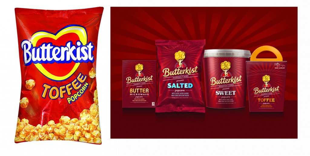
We haven’t looked at a before and after in a while. Let’s check out this new design from the UK’s leading independent producer of sugar confectionery and popcorn, Butterkist.
Let’s take a look here. To the left is the old design. The first noticeable difference is that of the color. They went from a fire engine red to more of a richer red, maroon almost. This rich velvety red is the official brand colour, and is used consistently across the product range. They offer a subtle background here to create visual interest as well as have re-vamped the logo and its imagery. This redesign is said to reflect Butterkist’s heritage and their long her association with the film world. Created in 1914 in America, their machine eventually made it to the UK in 1938. It is still popular today.
With such a prominent history in film, this new Butterkist identity has been designed to reflect the idea of a popcorn production company. The theme is reflected through the introduction of the ‘epic’ popcorn Atlas symbol, and a chiseled-style Butterkist logotype. The cinematic theme continues with the use of different typographic styles to illustrate ‘film-like’ personality into the individual parts of the package which allows for differentiation between flavors and creates a platform for a wider range of products.
What do you think?

