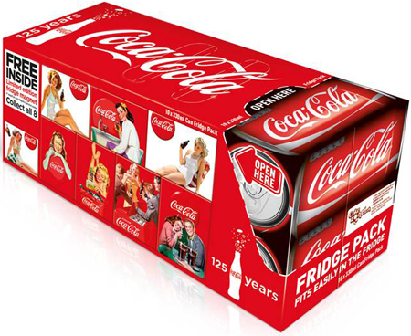
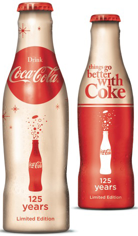
Coca Cola 125 years of iconic packaging
Growing up, soda was a treat. On the weekend or the in summer, going to my grandparents pool when allowed– Coke was the soda of choice. Even if the drink was a store brand cola, or even a Pepsi, it was always referred to as, “a Coke.” Granted I am in my mid 20′s but I remember the Coke cans–the red and white has always been a constant even with their Christmas versions, Olympic and so on. Their packaging has always been, to me, easily recognizable and will forever be a staple of my childhood.
Fast forward to my job and the field that I am in, knowing the importance of brand recognition–all of this nostalgia and being easily identifiable means that Coca Cola has been doing their job right!
The red and white has stayed consistent now for 125 years. A company called Bulletproof worked with the NWEN brand team to articulate the design rationale, that aligned with the strategic direction and global ’125 Years’ identity.
(From the DieLine) “We wanted to demonstrate that Coca-Cola’s iconic status is in large part due to it’s use of imagery and unique design – ABL, packaging, equipment et al – and that it’s visual assets are second to none.”
“Coca-Cola is about occasions and associated memories and through it’s clever use of design it has set the benchmark for encapsulating moments. 2011 was the year to celebrate this fact. (Senior Designer Amanda Lee)
Limited edition products:


 (Which include collector magnets)
To view the evolution, starting in 1894 click here: Frogview

