More on color…
With all of the hype on portion control and calorie counting, I find it odd that not more of these types of products are out in the world today. Sure, there are the 100 calorie pack and the new nutrition keys–but a lot of the foods and beverages out there can be deceiving. You think that you are eating or drinking something that is low calorie but when you look closer– what you just ate was three times the amount per serving!
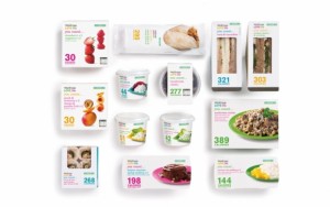
 I am a fan of the more direct, clear cut line of thinking. So of course when I saw this line of packaging, I had to read more. This is yet another example of how color can play a key role in package design. Here, the calorie count is big, and the colors are bold and eye catching. Just because you are calorie counting doesn’t mean your food or drink needs to be boring or not look as appetizing. The colors each have their own significance; for example the magenta means that the items contains beef or pork.
In reading this article, the use of color coding makes this line very easy to understand and still pleasing to the eye. To read more on the color codes click here
