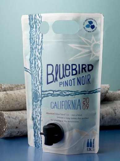
Wine in a Bag?
Sure we may all know of the classic Franzia wine bag within a box, but that is not what I am talking about here. In reading up on new packaging techniques, I came across an article that I found to be quite interesting. Overall, the concept makes a lot of sense. This new package design is a double gusseted stand up pouch used for wine called the AstraPouch.
Highlights:
• the pouch’s clear laminated film can be displayed on ice without da maging the decoration
• die-cut handle can double as hanging holes if a retailer wants to hang the pouch from a peg
• due to its size, it can fit right in a six-pack’s place in a convenience store’s cooler case
• the lightweight pouches cost less to ship. Unfilled Astrapouches reduce gas emissions by 85% compared with unfilled standard glass bottles on a per-liter basis.
• the Astrapouch reduces landfill volumes by at least 70% compared with glass bottles
• the pouches are so much less prone to breakage than glass bottles, so they also require less tertiary packaging
But the end question will be, would you drink wine from a pouch?
Turns out the key audience for this endeavor is millennials. From research, it is said that the demographic has a completely different view of wine than other demographics and that they are more likely to experiment with new things. This pouch also holds about two bottles worth of wine!
So let’s get down to the good part–the package design. This package is clearly larger than an ordinary wine bottle, so therefore gives any designer a much larger area to work their magic. A designer can decorate the entire front of the package, and the AstraPouch’s double-gusseted design makes sure the art isn’t distorted by bulges and creases in the front panel. Multilayer film pouches, such as the AstraPouch, brilliantly display designs by overlaying a transparent film over the printed film. This gives the pouches a bright, glossy appearance. And the pouch printing-and-converting process doesn’t require the gripper edges associated with many other package deco-and-manufacturing processes. So designers can have their artwork bleed off edges. (source)
So now that we have talked about the package itself, what about the design? The name of the company that took the plunge into the wine pouch world is called Bluebird. Instead of using the traditional wine color pallet, the design company hired to make this pouch come to life, CF Napa opted for the use of blue. Blue is not typically used in wine packaging which would be a signature move for the company and not to mention it helps reinforce their brand name which so many people have trouble remembering.
Choosing light blues as the primary colors also enabled CF Napa to play with complementary colors, such as the reverse white and bright orange, in their design. The resulting look, is crisp and clean, and it really stands out on retail shelves.

