Out with the old…
And in with the new. Yet another big brand has re-vamped its look to keep up with the ever changing ways of pop culture.
Seagram’s, best known for their ginger ale, is a subsidiary to Coca-Cola. Like we have said before and shown, Coca Cola is always keeping with the current events and constantly staying fresh–as should other members of their family.
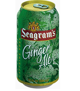
 Here’s a look at the old Seagrams.
So with any brand, the challenge is how to update such a well know brands without losing some of outs most valuable assets. Take a look at this can. You will notice that the brand has two main iconic elements. The Seagram’s crest and the word mark.
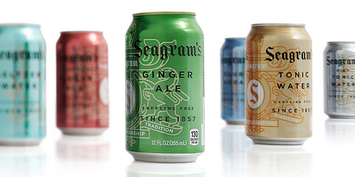
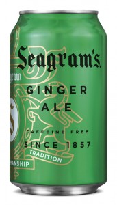
So in the new cans, (right) you will notice that the crest was modernized, in other words it was simplified and reduced to one line weight. The crest is now more of a friendly element than a crown jewel, with visual treatments such as placing type over it and wrapping it around the corners of cases. It now resembles more of a water mark than a bold crest. At the same time this has allowed the crest to have more of a visual presence and impact that it did not have had before.  Notice that in the entire line up–each of the line extension cans have their own crisp, clean metallic versions of the colors consumers associate with the flavors category.

