Archive
Uncategorized

It is always important to keep up with the latest trends when it comes to  graphic design, brand identities and of course package design. Trends in the design world have been to keep things simple-using clean lines and less colors. In the packaging world, we see on shelves and hear in the news about going green- using less materials or materials that have been recycled and so on.

So what about a beverage that does not need to be refrigerated? A product that will cut down on energy usage?  A can that can chill itself? I read this article from  Package Design Magazine and could not help but share:

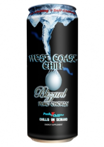
Scheduled to launch the end of the Q1 2012, West Coast Chill Pure Energy Drink will be packaged in a self-chilling can. The can uses the EPA Stratospheric Award winning Microcool technology, developed, patented, and licensed by Joseph Company International, which is eco-friendly using CO2 reclaimed from the atmosphere, and activated carbon ascertained from a renewable vegetable source. An activation button on the can allows the beverage to drop 30 degrees within minutes. The Chill Can does not require any energy and eliminates the need for any refrigeration as it Chills on Demand™ anytime anywhere.

“The Chill Can will revolutionize the beverage industry, and the way the consumer perceives a cold drink,” according to Joseph Company International CEO, Mitchell J. Joseph. There have also been special recycling bins made for these cans. If they are re-used this will help reduce the energy drink’s carbon footprint.

So–this product is doing a little of everything!

Click here to find out more

Read More

As a holiday treat this year, we here at Works Design decided to combine two of our favorite things: booze and great design.

In being loyal patrons to the restaurant Sapori, Franco Lombardo—the executive chef—has spoiled our taste buds with delectable dishes and his house-made chocolate cello. We asked him to provide us with a batch of cello and in return we were going to create him a package design with newly refined Sapori Branding.

Below you will see what we hoped the package would look like before shipping (cough cough).

From the bottling, fresh new artwork on the label, the foil wrapping, the gift tag, artwork on the wooden box and the cocoa shells—these elements were carefully planned and individually packed for our friends and clients to enjoy.

This is just the first peak of the new and improved branding we will be rolling out for Sapori. Check back for new menu designs, signage, website and more. If your mouth is watering for some of this cello–I suggest you stop fighting the urge and get yourself down to Collingswood and into Sapori!

Read More

As 2011 comes to a close, we here at Works Design Group think about everything that has come our way throughout this year.

Even though they say times are tough out there, we have still managed to keep our doors open. We would like to personally thank each and every one of our clients–current, new and future, for choosing our team here at Works Design Group. You challenge and push us to make us a better team of designers. We are grateful for the opportunities that we are presented with and the ability to continue to satisfy each client that comes our way.

For 2012, with high hopes, we look forward to further expanding our team, capabilities and clientele. We hope to push ourselves further and showcase all that we are capable of here. We wish you and yours a very Happy Holiday Season and Best Wishes for 2012!


Read More

Line extensions–you want them to keep the look of your brand and its equity but you always want it to stand out–making them unique in their own way.

Take  a look at the new Mission Artisan Style Tortillas. This particular product is brand new for the Mission. These tortillas are slightly thicker, less uniform, and are made up of unique grains which leads to a more crafted tortilla. Mission wanted to have these tortillas exude more of a small-batch, hand made feel– making them seem more authentic.10 20 11 artisan6Even though this product is brand new for Mission, when you look at the package, this is still very Mission. This package brings in some of the brown paper qualities from their existing chip bags as well as some assets from their taco shell line. They stuck to the same packaging format–the resealable bag so again all elements that their repeat customers are familiar with.

As far as making it stand out–notice the type/font for this new product. It seems to have more of a crafted feel. The color pallet used for the different varieties even has more of a riche feel with the dark green, brown, blue and red as opposed to the vibrant green, yellow and bright reds on their other products. The claims are clear and are different with each variety. The illustrations are simple, correlate with the variety color but break up the text in a nice way. This is a great example of a line extension–the branding is clear, the packaging is clean and the product is brand new. What more could you ask for?10 20 11 artisan210 20 11 artisan3

Read More

No I am not referring to the Triple/Double rainbow man…ha

Even though I normally share with topics such as package design, pictures, comparisons and advertisements–when I heard this on the radio I figured why not talk about a new product?

Image provided by Nabisco World

Arriving in stores now is the new Triple Double Oreo Cookie. I know what you are thinking–more filling SWEET! Triple stands for the three layers of cookie and the double refers to the cream. But not so fast. I never said it was the original vanilla filling…Oreo has released this layered cookie with one side having the vanilla creme, and the other having chocolate cream.

So when you look at the original Oreo cookie, they are about 50 calories per cookie–making these new cookies about 100 calories each! Think for a second…compare an entire 100 calorie bag of snacks (chips, pretzels, even cookies) to just one cookie?

Doesn’t this completely go against all of the obesity acts, calorie key reforms and healthy options that we are trying to enforce? Not only do we have a highly sugared cookie–but now we are going to double it?! Granted if you can limit yourself to just one cookie, it may not be so bad, but if you don’t like chocolate–why bother?

Another item to add to the reason why our obesity rate is so high? Or a great new innovation?

What do you think?

Read More

When you walk into a local convenience store wanting a soda, do you ever stop to think about the bottle? The shape, what it is made out of, does it speak for the brand? Chances are you don’t. However–maybe when this is released, you may…

Here is the current Mountain Dew packaging: (right)

The bottle is that of similar shapes to other Pepsi Products. Its label stretches to cover the majority of the bottle, with its distinctive green. Does it speak for Mountain Dew?

How about now? Its new ownable package. (below)

According to Pepsi Co. and their collaboration with 4sight inc., they goal was to energize the Mountain Dew brand. Together, the crafted a new PET bottle that will stand out from others in the same refrigerator. The new bottle design includes a much more distinctive silhouette. Its profile alone creates a certain strength and energy which will hopefully grab the attention of consumers.

Stuart Leslie, president of 4sight, says: “The previous bottle design for Mountain Dew didn’t convey the beverage’s essence, but the new structure makes a strong statement about what the brand embodies—a robust spirit of fun, exuberance, and refreshment.” (Package Design Magazine)

Unlike other brands out there, this bottle features an “MD” logo embedded on the bottle, it too features a newly styled grip which looks as though it is on the inside, but it actually on the outside of the bottle. It you notice, the label is significantly smaller than the previous design. This is due to the fact that the emphasis will not shift onto the new and improved bottle to tell the Mountain Dew brand story.

The best part is that production and retail operations will not have to change either–the new bottle fits both the current bottling system as well as its distribution channels.


What do you think New or Old?

Read More

Every morning when I go into Wawa to grab my iced coffee, I pass the infamous Tastykake & Entenmann’s displays. Some mornings, I can almost taste the Entenmann’s Coffee cake or Raspberry Danish Twist. But what I didn’t know, is that Entenmann’s makes coffee too?!

Did you know that?

Imagine putting some of those irresistible flavors not only on your plate, but in your morning cup! Of course, my mouth again began to water as I was fixated on the imagery and of course the idea in general. Here is a look at the old packaging:

07 21 11 ent1

However, with consumer testing, although blue is their signature color, consumers opted for the use of white as the background color.

What do you think?


My thoughts are that this white gives it more of a premium look. I think the simplicity really makes the product stand out. Each flavor is color coordinated and the text gives off a lighter feeling rather than bold or heavy. Even the gradient within the variety/flavor name exudes a lighter more upscale feel.

The photography again is simple–no fuss, no fancy set up or props, all on white–straight to the point. There is coffee in a cup, beans in the back, the variety is pictured next to it and mentioned below. Not to mention, this package gives Entenmann’s a second product plug in using photography of their already existing baked treats! Double Whammy!


Read More

Christian Boer is developing a typeface he hopes will help dyslexics overcome their inability to discern letters from one another. Watch this video to learn more.

Info provided by DesignTaxi

Read More

In browsing the internet today, I came across this post on brand channel titled, “Converse to Artists” If the Shoe Fits.” This was way too cool for me to not pass on. It just goes to show you where creativity really lies and with technology today–only where it will go!

According to the post, there are 480 Converse Chuck Taylor All Stars–each shoe features three colors.  One side being red, the other side blue and the front is white -perfect for this time of year! Each shoe is mounted on a servomotor which is capable of rotating them 180 degrees–as they put it “a motorized Chuck Taylor wall.”
Converse partnered with Perfect Fools and combined the latest in physical computing, engineering, custom-made content and music. This interactive wall is controlled by three synchronized servers. The shoes act as pixels just like any other screen and display images, videos, games, and so on. Making it, in my opinion, one of the coolest brand experiences out there!


Check out some of the videos:

Read More

In the grocery store this weekend, I was walking through the snack aisle when a package caught my eye. I didn’t recognize the brand at first glance, so I decided to take a closer look. When I got up close, I couldn’t believe it! It was SnackWell’s!

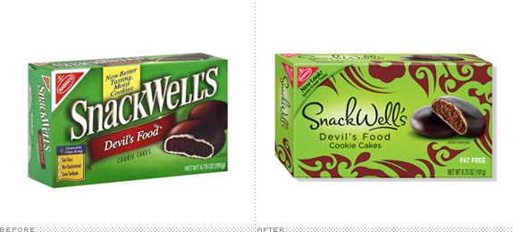
Snackwell's Pakcaging, Before and After
I must admit I have never tried/bought any SnackWell’s products but I do remember the commercials from a long time ago. To tell you the truth I didn’t know that they were still made! I was used to seeing the heavy green box with white lettering and food image. So when I say this almost lime greenish box, it definitely caught my eye, not to mention I thought it was a store brand before I was close enough to see the name.
So as previous posts have discussed, is that a good for bad thing?
For the purposes of their campaign message, I would say that it is a good thing.
Like I said it caught my eye, as did the new flavors. Also when I saw that it was SnackWell’s I knew that it would be a brand that I could trust.

The green eh–maybe not my number one choice however from a brand perspective–the green is a form of the SnackWell’s brand color as well as exudes a healthy option. The font treatment gives a feminine feel and the other illustrations make the box stand out. The color choices for each line extension are bold and look like they could be an animal print of sorts–which in my opinion further drives the “be bad, snack well” attitude.
So in seeing these new products and having never heard anything about them, I decided to do a little research online.
The re-invented SnackWell’s is brand-wide transformation of both the look and overall attitude. “Through our research, we found women’s attitudes and preferences toward portion control have evolved in recent years,” said Steve Siegal, Senior Brand Manager, SnackWell’s. “Today’s women want ‘calorie control,’ but they also want snacks that can satisfy their sweet tooth with rich flavor experiences and a variety of portion sizes.  And that’s why we turned to SnackWell’s, one of the original better-for-you snack brands, to bring women these new snacking choices.” To find out more visit: PR Newswire
The campaign’s key message is, “You can be ‘bad’ all you want in the things you do – because now there’s a way to be ‘good’ when it comes to sweets”. Click here to learn more about the change.
So, the idea is for women who want to keep their health in mind but not sacrifice taste–which I think is pretty reasonable.
Read More