Archive
Uncategorized

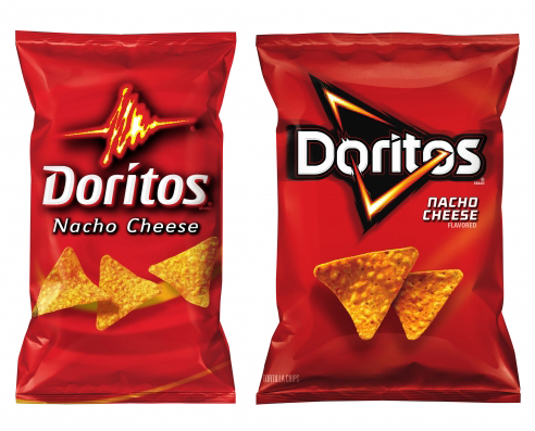
This past March, Doritos rolled out a new look for many of its products that launched in the U.S., U.K., and Mexico, with a global rollout planned in virtually all the countries where Doritos are sold.  While the brand previously had dozens of packaging variations in different parts of the globe, the new design creates a central package design architecture. This move towards a single package design is a trend that has been hot for quite some time and continues to spread across many segments of the CPG industry.  Companies such as PepsiCo and Colgate-Palmolive have followed this trend in a variety of product categories.

Doritos partnered with design firm Hornall Anderson to create this new, sleek and simple look that moves towards an even simpler design than its existing versions. The new design offers more negative space, more emphasis on color blocking and a more compressed lockup for the logo and variety.


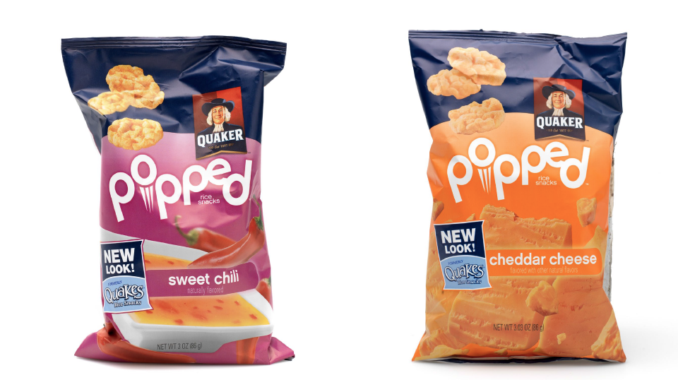
BAG WITH OLD LOOK / LOGO                        BAG WITH NEW LOOK / LOGO

Read More

Today we try to focus on eating and drinking healthy and staying away from sugar and “the bad stuff” (i.e. soda). But Pepsi is telling us that when we do splurge, we should rejoice in doing so. In fact, we need to splurge every once and a while with a Pepsi. We need to “Live for Now.”

Of course, just telling us to “Live for Now” won’t do the trick. We need to see it and feel it. Showcasing happy people in commercials and billboards? Check. Sponsorship of the Super Bowl halftime show and collaboration with pop superstar Beyoncé? Check. Ok. But sales are still down. So, what comes next? …make the package of the actual product feel as energetic and up-to-date as the people consuming it. And so, Pepsi unveils the re-design of their 20 oz. single serve bottle, the first re-design in 17 years. Yep. It’s about time.

“This new bottle is the next milestone in Pepsi’s Live For Now marketing campaign,” said Angelique Krembs , Vice President TM Pepsi Marketing. “Our single serve bottle is the most visible and tangible connection point we have with our consumers, and we love how the new bottle expresses our brand DNA.” (Packaging Digest, 3/25/2013)

The bottle has a contoured bottom half to make it easier to hold. The wraparound label is shorter so more of the drink is exposed. The simple, yet easy-to-grip bottle and design captures the youthful spirit. We can only wait to see if it’s enough to increase sales. The new bottle is the first in the re-design of the full portfolio currently underway, with additional elements to be rolled out throughout the year. The company expects the new bottle to completely replace the current design over the next year to two years.


Read More

Ain’t no stoppin’ us now. Works Design Group continues to grow. Within 6 months, we’ve added our 2nd full time team member to the mix. Kory Grushka comes to WDG from a completely different scene as a corporate lawyer, but that’s not to say he doesn’t know branding and design. In addition to his law degree, he also has his bachelor’s in computer animation and graphic design. Together, with his experience in the corporate world and his passion for branding and design, Kory is dedicated to taking WDG to new heights.

Read More

We’ve been doing our research. We’ve found that more and more brands are calling attention to their new look or variety by using the word “new” in various ways on the design of their package or product – in a bar, across a box, in a circle, you name it. This word has become so important that some brands are creating their entire design around it, others even going a step further and telling consumers what’s new about it on the design. Take a look below at the different ways and places you’ll see this word used on product designs.


Some brands, like Pepperidge Farm and Fiber One are using what are called “basic interrupters.” This means that the word “new” is not affecting the whole layout and design on a product, but is just a small call-out on the front.


Here are more examples of basic interrupters:

Here are examples of design altering call-outs. As you can see, the word “new” takes up the entire top portion of the boxes below, and utilizes a completely different color than the rest of designed box.


Often times, when brands are creating a line extension or a new variety, they also want this called out by using the word “new.” Fiber One does this on the box design of their new Nutty Clusters & Almonds variety.


Still, many brands want consumers to know exactly what is new or different about their product, so they make sure to explicitly state it on the design of the bag, box or package.

Quaker wants consumers to know that even though the look of their bag changed (as well as the brand name), that the mini rice cakes still have the same great taste.


Schar however wants consumers to know that they in fact did make the actual product better – it’s a new recipe this time that they are using to create softer rolls. And Ensure uses two tactics. Peach is a new variety, but they still want to reiterate to consumers that the Ensure brand in general is a good source of protein.


Read More

For our 2012 holiday gift to our clients, we decided to design and deliver mini carrot cakes by the dozens. From creating the logo, to drawing up the box and making sure each color blended perfectly, to even photographing the freshly baked treats, we left no detail untouched. And if you weren’t lucky enough to receive one of these all-natural packages, keep an eye out for our next post where we’ll unveil the finished product.


Read More

Works Design Group welcomes the newest member of their team, Maureen Kolodziej. Maureen will be managing client relations, marketing and communications.  She’s worked for national companies such as Toll Brothers, the luxury home builders, as well as local Philadelphia magazine. She’s also had experience at firms such as Star Group and Tierney Communications, plus the Philadelphia Tourism Marketing Corporation (GPTMC).

She knows what clients want. And she’s intent on making sure they get what they need.  From conceptualizing to copy writing, she’s got a passion for creativity.  But it’s out in front of people where she shines the most.  She’s a team player who brings everyone together to ensure the final product is approved, awesome and on time. She can’t wait to begin working with you!

Read More

Works Design Group recently created this frosty logo and it’s alternate for our friends at Honey’s Angels, a Philadelphia-based organization that provides food and grocery giftcards to struggling families during the holiday season.


The grassroots effort, begun by the McVey family in 2006, honors Helen “Honey” McVey, a generous, compassionate woman who spent much of her life caring for others—her family, her neighbors, the sick and the elderly. In year one, Honey’s Angels assisted just 17 families. This year, they’ll help at least 200, bringing their grand total to nearly 750 families served.

Each year, the McVey family rallies relatives, friends and members of the community who generously donate their money and time to make the outreach a successful one. Volunteers scour local supermarkets for bargains, pack boxes with all of the food families need to enjoy complete holiday dinners and gather on delivery day—this year taking place on Sunday, November 18—to transport the food to recipients.

So what inspired us to create this mark? Every year, Honey’s granddaughter Brittan makes angel-shaped sugar cookies that are distributed to each family with their food. These tasty treats are always a big hit, and they look remarkably like the logo seen here.

Here’s to Honey’s Angels, and here’s to a happy Thanksgiving for you and yours!

Read More

We haven’t looked at a before and after in a while. Let’s check out this new design from the UK’s leading independent producer of sugar confectionery and popcorn, Butterkist.

Let’s take a look here. To the left is the old design. The first noticeable difference is that of the color. They went from a fire engine red to more of a richer red, maroon almost. This rich velvety red is the official brand colour, and is used consistently across the product range. They offer a subtle background here to create visual interest as well as have re-vamped the logo and its imagery. This redesign is said to reflect Butterkist’s heritage and their long her association with the film world. Created in 1914 in America, their machine eventually made it to the UK in 1938. It is still popular today.

With such a prominent history in film, this new Butterkist identity has been designed to reflect the idea of a popcorn production company.  The theme is reflected through the introduction of the ‘epic’ popcorn Atlas symbol, and a chiseled-style Butterkist logotype. The cinematic theme continues with the use of different typographic styles to illustrate ‘film-like’ personality into the individual parts of the package which allows for differentiation between flavors and creates a platform for a wider range of products.

What do you think?


Read More

So a lot of this blog and inspiration that we look at tends to be package design, advertising and so on. We never really mention or showcase any of the other types of marketing for example a point of purchase display (PoP).

When it comes to the idea of a PoP, some consumers overlook them, others find them very helpful. Did you know that there is a competition for these? Take a look at these below, PepsiCo and 3M were gold and platinum winners in the Convenience Stores and Speciality Store channels.


The 3M display shipper for its new apple-shaped Post-It note dispensers has an attention-grabbing header and the waterfall layering shelves that allowed the product to be shopped easily.

The PepsiCo’s Mountain Dew Cooler Door Oversize Bottle display is a large graphic replication of a bottle that used untapped real estate to draw attention to the brand.

What do you think?


Read More

In case you didn’t see our Facebook post, this year’s Color of the Year is Pantone Tangerine Tango.
Since the release of the color, Pantone has teamed up with SEPHORA to create a collection that they hope will change the way people wear, feel and think about color. Launching this Spring, SEPHORA + PANTONE UNIVERSE™ delivers insightful color forecasting, timely trends and power seasonal product collections.

Check out this video:

Check out some of the products that were created:
03 21 12 pantone


Read More