Archive
Packaging/Refresh

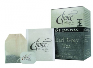
In staying up to date with the packaging world, I came across an article that I found interesting. A company called Choice Organic Teas seemed to be having a little bit of an identity crisis. Their packaging had not been changed since 1989–the complete opposite of everything we talk about!

Apparently, as a result, the company was receiving a worrying compliment from consumers–”They were surprised to find out how good our tea tasted,”says Anne-Marie Phillips, head of sales and marketing. Judging by this feedback, clearly consumers would be hooked to the product once they tried it but with such outdated packaging.–HOW would they get consumers to try it?

As with any redesign, capturing a new market without decreasing the current market creates a challenge. In this case, research showed that loyal customers were very familiar with the brand’s packaging–to the point that some of them couldn’t remember the brand name and identified the teas solely by the packaging–not exactly the ideal brand recognition. Another major roadblock that the company was learning was that consumers never referred to the brand by its full name. People referred to their product as “Choice” when the full name is actually “Choice Organic Teas.” This differentiation was a key goal in the refresh.

OLD: When you look at the old and the new packaging some of the major design elements remained. Elements such as:

• large logo area with its white background

• the use of color-coding at the middle and bottle of the carton to identify each variety.

However, other parts of the package design were not working so well. One key problem area was the amount of copy. “We had the word ‘organic’ listed three times on our box and yet it still wasn’t really getting conveyed,” Phillips says, incredulously.

Solution: changing the color of the certified organic logo from black to green.

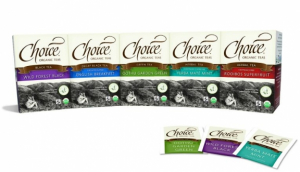
NEW: Even though some of the original design elements stayed the same, the new design has a few highlights:

• caffeine indicator graphic and an origins map.

• new illustration of tea leaves, on the front panel

• each variety is identified by a richly colored banner that describes the tea type (previously each tea type was called out in a black band)

Color is more prominent throughout the complete redesign. The old cartons were printed using spot color inks only. Now, a KBA Rapida press prints the clay-coated paperboard in four-color process plus one spot color. The process inks create jewel tones that are vibrant and contemporary, and the one spot color optimizes legibility of small type by preventing print registration problems.
The design changes carry through to inside the carton, where Choice Organic Teas replaced its black-and-white universal tea envelope to variety-specific envelopes printed in three spot colors. The envelope paper is an oxygen-whitened stock that, along with the carton’s 100% recycled/65% post-consumer-waste paperboard, helped Choice Organic Teas win this year’s Responsible Packaging Award from the Food Trade Sustainability Association. (source)


Read More

Of course one of our favorite categories when it comes to design. Some people watch those “best/worst dressed” shows, or read those magazines–we look down the aisle at a grocery store or retailer at packaging.

Ivory soap–has been around for as long as we can remember.  As you know we are firm believers in keeping things new and fresh. This, for many brands, is a constant struggle. So for Ivory, what was the problem? Overall, the brand was looking to increase the impact at shelf with new consumers but at the same time do so without taking away from their repeat customers. What was needed is emphasis on the brand’s attributes of simplicity and cleanliness with an equally clean design. KISS–keep it simple stupid! Here is a look at the before:

So what was their solution? Add a pop of color! According to P&G Design Manager Sidney Fritts, “The new color for the original bar of Ivory is a vivid blue that is both assertive and optimistic. A vibrant color system will also help consumers to clearly identify other fragrances in the product line, including lavender and aloe.”

This use of color provides a backdrop to a photograph of the iconic bar of soap–which lets face it isn’t always easy to do. The new logo is an evolution of the Ivory word mark as it existed in the 1950’s, a tribute to the brand’s heritage. This new packaging also emphasizes the number of bars in each package – more than that of many competitors – through a clear window at the top to reinforce the brand value.

The new design promotes Ivory’s classic, clean image to loyal fans while providing a new pop of color to consumers still exploring the soap aisle for a new fave. The new packaging is also combined with a new print & tv ad campaign.  What do you think?

Read More

One of our favorite topics is package re-design/re-fresh. We all know the importance of staying fresh, one step ahead but of course keeping with your company’s overall brand identity. The product of the day is Unilever’s Vaseline. Vaseline, a 140 year old brand, initiated a new this newly designed package to showcase its new formula. This communication will be backed up through multimedia advertising, social media, PR and sampling.

Redesigned Vaseline lotion packaging

The new look for these three lotions stick to their core. The brand name is still clear, large and highest on the bottle. Overall, the idea behind the design was to put emphasis on what makes these particular products special to the consumer. Since the formula has changed, the emphasis on ingredients has increased by the use of imagery. These new bottles are complimented with warm tones that match each variety. These images bring a more modern feel and seem to grab a little more attention compared to an all text package design.

Global brand vice president – Vaseline and St Ives Ricardo Pimenta comments, “Vaseline is one of the most trusted skincare brands on the market. The combination of reformulation, repackaging and the new communications platform will keep it at the front of consumers’ hearts and minds.”

Coming to the US soon!

Read More

When you go to the movies, many viewers are either preview lovers or haters. How about a studio introduction or logo? Do you notice that? Normally when watching a movie at home that is the last time you can get up before you miss any of the action; or at the theatre, a safe zone once you return back to your seat.

Do you think you would notice a difference if that studio logo were to change? Paramount, as part of its 100th Anniversary Celebration in show business, released a new logo– see below.

The new logo was premiered in the new Mission Impossible–Ghost Protocol movie December 21st.

Here is a look at the previous logo:

With its origination in 1916, compared to the refresh above, that rugged snow-covered mountain peak and stars are easily recognized by many. The new design has not stepped too far out of its bounds, paying homage to the history of the studio as well as a look into the future. This new logo with the “100 years” text will be used throughout 2012. Once 2012 has passed, “100 years” will be removed but everything else about the new logo will remain the same.

To take a look at more paramount logos, click here

Read More

As I was browsing the Dieline, one of our favorite sites, I came across this article.
I was intrigued to view the opinions as well as the visuals to go along with this study. What if you took a brand logo down to its absolute minimum? Would it help or hurt the brand?

Guinness was the first that Mehmet Gozetlik of the design collective Antrepo looked at.

Some might work at this 4th most simplistic level because of the brand equity that has already been established.  Would you still recognize it in the liquor store? Chances are yes. The can, color and taste will be the same.

But what about M&M’s? It almost looks like their original packaging!

So as some may indeed work at the 4th level of minimalism, most would work best at the 3rd level. The 3rd level would be where the logo itself stands out on a colored field within or with a certain shape (such as Pringles). If you took the image away I am not sure that it would have the same impact?

Would RedBull get as much recognition? Sure the can is the same shape but it has lost its signature color scheme…what do you think?

To read the full article, click here.

Read More

Even though baby food is clearly for baby consumption–that does not mean that the baby is the decision maker/purchaser of the product. Moms and dads are the audience that these products appeal to. So with that said, should the package designs be kid friendly?

Take a look at Little Duck Organics. This package in particular was awarded “Best Packaging” at Expo East 2011 for their new packaging designs. They product is a wholesome organic children’s snack “Tiny Fruits.” This packaging clearly speaks to adults with a very simple yet innovative personal tone. The brand recognition is simple, as are the flavors. The claims are clear and you can see what the product looks like.

Little Duck Organics winning packaging

Read More

With all of the brand names on shelf today, it is tough to keep track of  birthdays… who turns 50 in 2011? Quaker LIFE cereal!

Life cereal

To celebrate their birthday, promotional 50th birthday boxes of Quaker Life cereal will be hitting shelves across the country this month. To show their appreciation to the moms and kids that have kept them in business these past 50 years, specially marked boxes of Original, Cinnamon and Maple & Brown Sugar cereals will contain an official game message inside the carton. These messages will tell the consumer whether they have instantly won a prize for the whole family! These prizes range from a home theater system, digital video cameras to travel gift cards.

Quaker LIFE cereal became popular in the 1970′s with an advertising campaign featuring “Mikey,” a hard to please four year old boy. Today in 2011, Quaker LIFE cereal remains a wholesome, delicious choice for kids and grown-ups alike. The cereal offers 18 grams of whole grains per serving and is an excellent source of B vitamins to help convert food into energy.

Happy Birthday!

Read More

As you may have seen throughout previous blogs, both Coca Cola (original) as well as Diet Coke have premiered new package designs. Noting that they are in their 125th year in business, we know not all of their products have been around as long. That is not to say that change shouldn’t happen across the board.


Take a look at the new Coke Zero. Notice the simplicity of the design, but the new impact the packaging makes.

So sure the look has changed, what else? To keep things changing and to broaden the spectrum for consumers, Coca Cola has teamed up with Sports Illustrated now that football season is approaching to form a new program for the die-hard football fan. This new program being introduced will offer exclusive content, VIP game access, once-in-a-lifetime fan experiences and thousands of sweet prizes to help those hardcore fans enjoy everything about the game they love.

So what Coke will do is feature a will feature a series of videos developed by SPORTS ILLUSTRATED® that take fans deep into football’s most heated, stalwart rivalries. Each video also provide the kind of insider pre-game information that only SPORTS ILLUSTRATED® reporters can uncover. In conjunction with EA SPORTS™, Coke Zero Black Edition also will offer an inside look at the company’s design labs where fans can see how games like NCAA® Football 12 are made.

Fans can also enter a sweepstakes to win a multitude of prizes and packages online through entering, sending texts and much more. So finally a way to get rewarded for drinking your favorite product! Will those who don’t drink Coke Zero suddenly jump ship?

To find out more visit: cocacola


Read More

When I go into CVS, Walmart or Target, I am never shy of buying the store brand. Granted there are some instances where I will buy the better stuff for example, when serving alcohol or a fresh salsa–but never the less I am all about a bargain.

To be honest, I can barely tell a difference. With that said, coming from the creative industry although the product may not have much of a difference on the inside; the outside or its packaging in most cases, has a very noticeable difference. Take a look at the examples below:

You have the well known Kraft Macaroni & Cheese to the left with its eye-catching predominately blue packaging. The photography takes up a large portion of the package with the main focus being on the spoonful of macaroni. Their branding as well as supporting claims are bold, large, and use a variety of colors. When you look to the right, you see the Great Value package. Being predominately white, that is the first noticeable difference. However, their photography seems a bit more toned down in having a simple table setting with the macaroni in a white bowl. Even though Kraft has a similar color palette, the colors on the Great Value packaging are a bit more muted. The fonts too are more generic, simple and standard. The package itself seems to have less going on– it seems dull and drab compared to the high energy that the Kraft Macaroni and Cheese box exudes.

When a major company such as Kraft spends a lot of money to produce a package, they need to charge more for their product in order to keep up their profits. Therefore in terms of a store brand, the less the company spends on the design and production of a product, the more they can afford to slash the sale price. In other words, their photography may not be as nice, they may not use as many colors or have as many windows, but when it comes to price–its better for the average consumer.

Sure there is a major difference in their packaging as well as price, but is there a difference in the taste?

Read More

Previous Kudos Packaging

New re-designed package

Yet another brand refresh.

This time, it has a bit more to do with the package rather than the logo. Kudos has maintained their original logo across the top, making their brand still easily identifiable but put a new twist on the package.

You will notice the obvious color change. While prior the box was very heavy on brown; the new package puts a brighter spin on things in having a prominently yellow box. They do however tie in the brown at the bottom. These new brighter packages will give the products a stronger presence on the shelves.

The new package has allowed:

• the brand name Kudos to take up a larger real estate on the package

• more room for larger product photography

• new graphics, which are a step up from previous designs

• more emphasis on the cobranded logos at the bottom

• illustrates the new nutrition “keys”


What do you think? Kudos for Kudos?


Read More