Archive
Branding

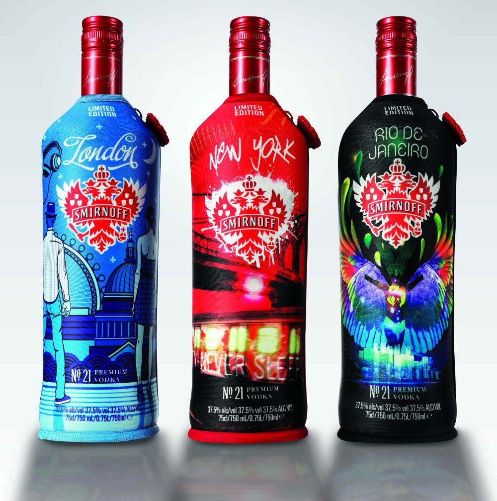
Smirnoff is introducing new limited edition bottles based on the nightlife of four of the world’s biggest party locations. Starting last year, this campaign was set to aim to reflect the atmosphere and culture of their place and also have recipes on the bottle for cocktails that best suit that area.

The first four locations are as follows: New York, London, Rio de Janeiro and Australia. According to Pop Sop, “New York famous for being the city that never sleeps, has a wide range of clubs to fit any wallet and taste. London is proud to invite visitors to the coolest clubbing scenes in the world like Ministry of Sound or Club Aquarium where people can dive in the swimming pool or jacuzzi. Rio De Janiero ‘makes’ people moves people through its streets day and night to the rhythm of samba. Nightlife in Australia is diverse, welcoming and unique as every location has something specific to offer.”

Let’s take a look at the good stuff, the design!

Notice with the London bottle–it has a bit of a refined look, while the New York bottle seems to have more of a graffiti look to it.

What do you think? What about other cities? Will there be more?

Read More

When I think of summer I think of the beach, the sun, frozen fruity drinks and the smell of sun tan lotion. When that strong coconut scent fills my nostrils, I instantly am in the summer mentality. One of the liquors that also comes to mind is Malibu Caribbean Rum. The rum literally has that sun-tan lotion smell as soon as you open the bottle.

I have always referred to or thought of Malibu as a summer-time liquor just because I don’t really find myself or others drinking a frozen beverage or a fruity cocktail in the dead of winter. But, as it turns out Malibu must have been feeling that very same way– until now. In an article that I read, Malibu is set to release a new innovative limited edition winter-inspired coconut rum which will contain coconut flakes. The new coconut flakes are supposed to mimick the idea of snowflakes and too are reflected on the new label as well. Check it out.

Malibu in congruence with the bottle and formula, is releasing new seasonal recipes to reinforce its versatility. I will be curious to try the new recipes!

Is it that simple? Taking a product and putting a new marketing spin on it? Maybe it is–only time will tell!


To read more, visit talkingretail

Read More

When I go into CVS, Walmart or Target, I am never shy of buying the store brand. Granted there are some instances where I will buy the better stuff for example, when serving alcohol or a fresh salsa–but never the less I am all about a bargain.

To be honest, I can barely tell a difference. With that said, coming from the creative industry although the product may not have much of a difference on the inside; the outside or its packaging in most cases, has a very noticeable difference. Take a look at the examples below:

You have the well known Kraft Macaroni & Cheese to the left with its eye-catching predominately blue packaging. The photography takes up a large portion of the package with the main focus being on the spoonful of macaroni. Their branding as well as supporting claims are bold, large, and use a variety of colors. When you look to the right, you see the Great Value package. Being predominately white, that is the first noticeable difference. However, their photography seems a bit more toned down in having a simple table setting with the macaroni in a white bowl. Even though Kraft has a similar color palette, the colors on the Great Value packaging are a bit more muted. The fonts too are more generic, simple and standard. The package itself seems to have less going on– it seems dull and drab compared to the high energy that the Kraft Macaroni and Cheese box exudes.

When a major company such as Kraft spends a lot of money to produce a package, they need to charge more for their product in order to keep up their profits. Therefore in terms of a store brand, the less the company spends on the design and production of a product, the more they can afford to slash the sale price. In other words, their photography may not be as nice, they may not use as many colors or have as many windows, but when it comes to price–its better for the average consumer.

Sure there is a major difference in their packaging as well as price, but is there a difference in the taste?

Read More

Budweiser, one of the most popular beer brands in the U.S. never seems to fail when it comes to staying on top. From catchy radio campaigns, to unforgettable Super Bowl commercials, Budweiser has maintained its status and continues to set the bar high.

As you may have read, awareness is key for brands, especially those within such tight competition. Budweiser, yes, they consistently keep up with their ads, and come up with new and creative ways to promote their product or make it stand out. A small example- the red can tab. Something small, but no other brand had done it at the time. However, what I admire most about them and what is probably the most important–they never stray too far from their origins.  Take a look at this timeline as I could call it. The evolution of the past few Budweiser cans.

Regardless of the subtle or major changes, you can always tell that it is a Budweiser can.  With the newest design (right) the bow tie is the focal point and is complemented by the time-honored Budweiser creed and Anheuser-Busch medallion.

Rob McCarthy, Vice President of Budweiser says,

“Our refreshed packaging design gives Budweiser an updated look, which dramatizes the iconic Budweiser bowtie and incorporates the brand hallmarks that loyal Budweiser drinkers will recognize and appreciate.”Budweiser’s new “bowtie” can and secondary packaging designs will be the global standard as the brand continues to expand internationally.”

Frank Abenante, Vice President, brands, AB InBev says:

“This new visual identity is one of many steps in our quest to reinforce Budweiser’s role as a true global beer brand. Together with our unifying global creative idea, the new global packaging look and feel will reinforce Budweiser’s bond with consumers around the world.” (source)

As you can see below–even though the design for the can runs vertically, the designs for the multi-packs are horizontal.


What do you think?

Read More

There’s something about before and after shots that really catch my attention. Whether it be a makeover television show like “What Not to Wear” or a home re-design like “Flipping Out” or “Extreme Home Make Over,” I always love to see what it was like before compared to what it looks like now. I like to see how little or big the changes were or how much of a difference one little thing could make.

Of course, with package design– that is the same thing. Sure I may notice the changes myself while browsing the retail shelves, but I don’t always have the old package in front of me to compare. You will notice a lot of my posts have to do with this because within the graphic design industry a lot of our clients are looking for changes and or refreshers to their already existing brands. Some designs are a huge hit, while others are a flop. To prevent this, much like any other company, we here at Works Design Group, take into account the clients competition on the shelves, what they would like to emphasize or accomplish with the new design, as well as something that we overall find to be pleasing to the consumer.

So let’s take a look at the before and after package design for Caribou Coffee Bags. Here is a look at the old bag: (close up)

Take a look at everything going on…(what I noticed)

• Copper-like tone throughout the bag with a strong glossy shine

• Large photo presence within the background that takes up almost the entire package

• The label on top of this background photo has yet another photo which changes per variety

• A Roast Degree Indicator ranging from Lighter-Darker

• The Caribou Coffee logo is placed at the bottom, almost secondary to the flavor and explanation


So, how about the new package? What a difference!

As you can see there is quite a difference. This brand re-design was debuted last year and has continued to roll out this year.

• Instead of the dark, shiny bronze-like color, this entire bag is now wrapped with burlap

• The labels are a little less busy than before, having illustrations verse photography giving them more of an handcrafted/natural  feel. These illustrations are kept simple but refer to the unique variety that is within the bag

• The Roast Indicator is still present. It appears to be a bit smaller than before, less prominent but still looks similar and gets the message across

• The logo as you can see appears on the top large enough for it to catch your eye. Their branding is again reinforced with their signature blueish-green pop of color at the bottom

Overall, where most coffee brands use dark, heavy colors, Caribou Coffee has stepped out of the box and made this package design more about the story of each blend.

What do you think?

Read More
Growing up, soda was a treat. On the weekend or the in summer, going to my grandparents pool when allowed– Coke was the soda of choice. Even if the drink was a store brand cola, or even a Pepsi, it was always referred to as, “a Coke.” Granted I am in my mid 20′s but I remember the Coke cans–the red and white has always been a constant even with their Christmas versions, Olympic and so on. Their packaging has always been, to me, easily recognizable and will forever be a staple of my childhood.

Fast forward to my job and the field that I am in, knowing the importance of brand recognition–all of this nostalgia and being easily identifiable means that Coca Cola has been doing their job right!

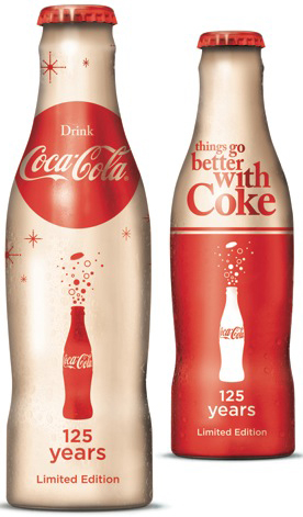
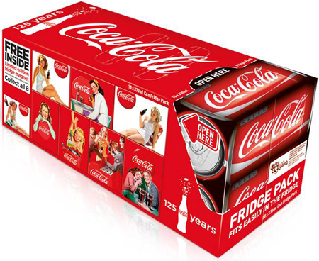
The red and white has stayed consistent now for 125 years. A company called Bulletproof worked with the NWEN brand team to articulate the design rationale, that aligned with the strategic direction and global ’125 Years’  identity.

(From the DieLine) “We wanted to demonstrate that Coca-Cola’s iconic status is in large part due to it’s use of imagery and unique design – ABL, packaging, equipment et al – and that it’s visual assets are second to none.”


Limited edition products:

(Which include collector magnets)


To view the evolution, starting in 1894 click here: Frogview

Read More

Updates. Newer version. New post. New Arrivals–words and phrases we are used to hearing just about every day. With the way of the world sometimes its hard to keep up, especially when it comes to your business presence. Even though a company starts with a logo, and grows with that logo– over time that same logo may need a little face lift to keep with the times.

Lucky for designers, we know what to do.

Here are two examples of how we here at Works Design Group have done this for our clients.

Water Lilies Foods is a private label food manufacturer of mouth watering Asian cuisine. Located in Astoria, NY, Water Lilies provides a wide variety of Asian gourmet specialty entrees and appetizers, with some items both USDA organic, and vegetarian. Water Lilies came to us in need of food photography to showcase their items. Starting with photography, then a catalog and later a website we, along the way, gave their logo a face-lift. We stuck with the original concept however, gave it much more sophisticated look and presence which we carried throughout their new marketing materials.  (to check their other materials click here.)

Another client, A. Meyers and Sons Corp. came to us with the need for a package design. They created a kit specifically for fashion design students- a large portfolio case filled with specific rulers that they would need. In the process of creating a unique package design, we visited his logo. Of course, it was not what he had originally intended to do, however once we showed him how it could look–he was sold on the idea. A bit more modern and easily identifiable.

Okay, so there were a few of our examples, now how about some of the big guys…


Courtesy of: Logo Design Love, Function Web Design & Development, google images

A. Meyers and Sons, Inc, Water Lilies Foods and Works Design Group, LLC.


Read More

Google tops the BrandFinance Global 500 list as the worlds most valuable brand at $44.3 billion.

Google tops global brand index, Coca-Cola loses some fizz

BS Reporter/New Delhi – Mar 22,2011 00:17 AM
Internet search giant Google has topped the BrandFinance Global 500 list of the world’s top brands. It was ranked the most valuable brand in the world at $44.3 billion, edging Microsoft ($42.8 billion) into second place. 

Coca-Cola dropped out of the top 10 for the first time ($25.8 billion) and BP suffered a $3.4-billion loss, which caused it to fall 53 places.

Facebook entered the table at 285th place, with a brand value of $3.7 billion.

American companies continued to dominate the index as US brands constituted 13 of the top 20 and 26 of the top 500.

Even as the top tier contained several brands that have existed for decades – IBM, Bank of America, HSBC – the world’s increasing dependence on the Internet was reflected by Google’s top position. Five of the top 10 largest growers are technology-related companies.

Read More