Archive
Design

When you think of Disney you think of movies, toys, backpacks, pens–how about deodorant?

Reebok collaborated with Disney on a design to market their deodorant to preteens. Reebok did this in hopes of an  increase in sales during the Indian Festive time of Diwali. Notice how although not bright and colorful, the design remains in sync with Disney Style guides and not to mention the Indian festival of lights.


Read More

Even though summer is at its midway point, Pepsi NEXT releases two new flavors to celebrate summer. These two new flavors Cherry Vanilla and Paradise Mango will only be available this season from July 15th through September 8th. The new additions are true to the Pepsi NEXT brand in being low-cal drinks with real cola taste and 60% less sugar.

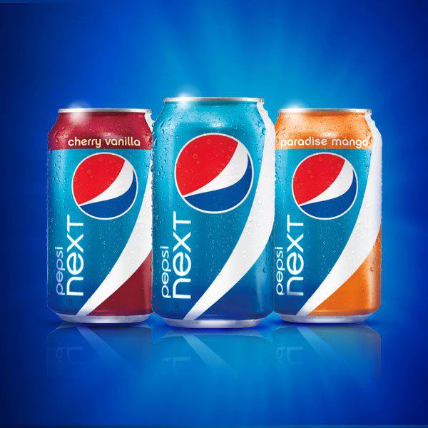
Paradise Mango has a tropical twist, while Cherry Vanilla is a mix of traditional tastes served in a new way. They even used actor William Levy, (who was named the sexiest man of 2011 by People en Español) to present the product at The Americana at Brand in Glendale, California.


Read More

Limited editions are one thing when there is a throw back, or a holiday but how about just because? Tuaca, a vanilla citrus liqueur commissioned celeb tattoo artist Corey Miller from LA Ink, to create an artistic version of their trademark lion. The lion is a classic brand image for Tuaca and symbolizes a tribute to Italy’s Medici family. This limited edition bottle, created by Miller, has been printed on the limited edition Perfect Chill bottle in thermochromatic ink. The “tattoo” turns from silver to blue when the bottle reaches the optimal chilled drinking temp.  When the liquid returns to room temperature, the lion changes back to silver. (similar to the Coors cans)


Read More

There is nothing worse than looking at a package or product and not knowing what it is, or what it does. What ever happened to K.I.S.S? (Keep it simple stupid)

Take a look at Scotts new Snap Spreader System. Their new packages were designed to take the guesswork out of lawn care. The product line includes a spreader and specially formulated products for specific lawn care needs, such as controlling weeds, killing insects and fertilizing.

The idea behind this was to of course help consumers know which product would be the best for their lawn care needs. The design needed to communicate its key features and benefits loud and clear. Getting these benefits were wrapped around the idea of  ”A beautiful lawn is just a snap away.”

Take a look at the type face–it is very easy to read, modern looking and of course locked up with the existing Scotts logo. Notice the graphics and bright colors used on the “Snap Pac.” To correlate with each color is a close-up circle device which depicts the solution to lawn care. What makes the package work is that all of these correlate with one another including a blue sky on the upper half of the bag and vibrant green grass imagery on the lower half to showcase the end benefit.

Lastly, a three-step instructional inset of Snap, Lock and Go illustrates how simple it is for homeowner’s to use the lawn care system. Easy enough right?


Read More

Sure we may all know of the classic Franzia wine bag within a box, but that is not what I am talking about here. In reading up on new packaging techniques, I came across an article that I found to be quite interesting. Overall, the concept makes a lot of sense. This new package design is a double gusseted stand up pouch used for wine called the AstraPouch.

Highlights:

• the pouch’s clear laminated film can be displayed on ice without daAstrapouchmaging the decoration

• die-cut handle can double as hanging holes if a retailer wants to hang the pouch from a peg

• due to its size, it can fit right in a six-pack’s place in a convenience store’s cooler case

• the lightweight pouches cost less to ship. Unfilled Astrapouches reduce gas emissions by 85% compared with unfilled standard glass bottles on a per-liter basis.

• the Astrapouch reduces landfill volumes by at least 70% compared with glass bottles

• the pouches are so much less prone to breakage than glass bottles, so they also require less tertiary packaging

But the end question will be, would you drink wine from a pouch?

Turns out the key audience for this endeavor is millennials. From research, it is said that the demographic has a completely different view of wine than other demographics and that they are more likely to experiment with new things. This pouch also holds about two bottles worth of wine!

So let’s get down to the good part–the package design. This package is clearly larger than an ordinary wine bottle, so therefore gives any designer a much larger area to work their magic. A designer can decorate the entire front of the package, and the AstraPouch’s double-gusseted design makes sure the art isn’t distorted by bulges and creases in the front panel. Multilayer film pouches, such as the AstraPouch, brilliantly display designs by overlaying a transparent film over the printed film. This gives the pouches a bright, glossy appearance. And the pouch printing-and-converting process doesn’t require the gripper edges associated with many other package deco-and-manufacturing processes. So designers can have their artwork bleed off edges. (source)

So now that we have talked about the package itself, what about the design? The name of the company that took the plunge into the wine pouch world is called Bluebird. Instead of using the traditional wine color pallet, the design company hired to make this pouch come to life, CF Napa opted for the use of blue. Blue is not typically used in wine packaging which would be a signature move for the company and not to mention it helps reinforce their brand name which so many people have trouble remembering.

Choosing light blues as the primary colors also enabled CF Napa to play with complementary colors, such as the reverse white and bright orange, in their design. The resulting look, is crisp and clean, and it really stands out on retail shelves.


Read More

With all of the hype on portion control and calorie counting, I find it odd that not more of these types of products are out in the world today. Sure, there are the 100 calorie pack and the new nutrition keys–but a lot of the foods and beverages out there can be deceiving. You think that you are eating or drinking something that is low calorie but when you look closer– what you just ate was three times the amount per serving!

I am a fan of the more direct, clear cut line of thinking. So of course when I saw this line of packaging, I had to read more. This is yet another example of how color can play a key role in package design. Here, the calorie count is big, and the colors are bold and eye catching. Just because you are calorie counting doesn’t mean your food or drink needs to be boring or not look as appetizing. The colors each have their own significance; for example the magenta means that the items contains beef or pork.

In reading this article, the use of color coding makes this line very easy to understand and still pleasing to the eye. To read more on the color codes click here

Read More

Even though baby food is clearly for baby consumption–that does not mean that the baby is the decision maker/purchaser of the product. Moms and dads are the audience that these products appeal to. So with that said, should the package designs be kid friendly?

Take a look at Little Duck Organics. This package in particular was awarded “Best Packaging” at Expo East 2011 for their new packaging designs. They product is a wholesome organic children’s snack “Tiny Fruits.” This packaging clearly speaks to adults with a very simple yet innovative personal tone. The brand recognition is simple, as are the flavors. The claims are clear and you can see what the product looks like.

Little Duck Organics winning packaging

Read More

Smirnoff is introducing new limited edition bottles based on the nightlife of four of the world’s biggest party locations. Starting last year, this campaign was set to aim to reflect the atmosphere and culture of their place and also have recipes on the bottle for cocktails that best suit that area.

The first four locations are as follows: New York, London, Rio de Janeiro and Australia. According to Pop Sop, “New York famous for being the city that never sleeps, has a wide range of clubs to fit any wallet and taste. London is proud to invite visitors to the coolest clubbing scenes in the world like Ministry of Sound or Club Aquarium where people can dive in the swimming pool or jacuzzi. Rio De Janiero ‘makes’ people moves people through its streets day and night to the rhythm of samba. Nightlife in Australia is diverse, welcoming and unique as every location has something specific to offer.”

Let’s take a look at the good stuff, the design!

Notice with the London bottle–it has a bit of a refined look, while the New York bottle seems to have more of a graffiti look to it.

What do you think? What about other cities? Will there be more?

Read More

Question: When it comes to oatmeal, how to you get it from the canister to your bowl? Do you use a scoop to prevent a mess? Make a mess?

What if I told you that PepsiCo created a new “Easy Pour” feature? Sure you may have seen those metal pieces on lets say sugar or salt, but this feature is different. Check it out. 

The new top to the canister features perforations on both the right and left side of the paperboard. Within minimal graphics, the directions on how to use the Easy Pour are simple and clear.  The new top provides consumers with three choices: the right or left for a more controlled pour and the third option being to remove the entire top.


How did this just happen now?

Read More

As you may have seen in previous posts on “The W” as well as our facebook page, Coca Cola is celebrating its 125th year.

To a designer, how do you stay on top of such a globally recognized brand? Take a look at the new can set to hit shelves this Fall. You will notice that the can still features the solid aluminum background however, look at what is magnified:


Who would think that a simple magnification would create such an impact? Not to mention with the enlarged “D” in Diet resting on top of the “k” in Coke, the full brand name is not revealed. Bold? Daring? I guess that doesn’t seem to matter–according to Ad Week (regarding the full brand not showing) they say that, “…the beauty of having a brand that’s already best-selling diet soft drink in the world: you don’t have to worry about things like that.”

So even though regular Coca-Cola has been releasing throw back cans, collectibles and limited edition cans, it looks like Diet is sticking to what they know and what has been working for them. The design is simple–even more so than before.


Is it safe to say that Diet Coke gets better with age?


Read More