Of course, we are always fans of the package re-design before and afters. Gives us a chance to evaluate what worked before, what works better and whether or not we think the right choices were made. Granted, we may not be experts but hey everyone can have an opinion right?
Bolthouse Farms Yogurt dressing used to look like this:
Notice the transparent label putting all emphasis on the product. The brand hierarchy seems appropriate as well as throughout the product line, the color scheme that is has established. However, one of the key benefits of the product or one important thing to know is that its base is yogurt–which this package clearly states in the beginning of the read. Imagery here looks nice and fresh. 
So now lets go to the new package. Here they went from a clear label to a unique die cut white-looking label. The hierarchy has shifted in that the “Yogurt” ingredient call out is pushed to the bottom but looks to have a bit more presence and emphasis than before. Notice the additions to this bottle:
• Low Fat, Low Calorie, Great Taste burst at the top label
• “New” burst
• 45 Calories per serving burst
Although this is new and the die cut label is unique–what do you think of the over all re-design? In my opinion it looks like they

took a step back in terms of the unique fonts, placement and the transparent label. Granted, the overall goal of this redesign looks to be to emphasize the health benefits and great taste which it clearly does. I think it works, I just may have to vote with the previous design. What do you think?

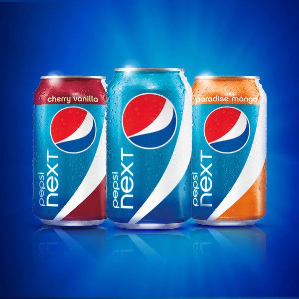 Paradise Mango has a tropical twist, while Cherry Vanilla is a mix of traditional tastes served in a new way. They even used actor William Levy, (who was named the sexiest man of 2011 by People en Español) to present the product at The Americana at Brand in Glendale, California.


 ry look.