So a lot of this blog and inspiration that we look at tends to be package design, advertising and so on. We never really mention or showcase any of the other types of marketing for example a point of purchase display (PoP).

When it comes to the idea of a PoP, some consumers overlook them, others find them very helpful. Did you know that there is a competition for these? Take a look at these below, PepsiCo and 3M were gold and platinum winners in the Convenience Stores and Speciality Store channels.
 

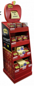
The 3M display shipper for its new apple-shaped Post-It note dispensers has an attention-grabbing header and the waterfall layering shelves that allowed the product to be shopped easily.

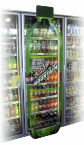
The PepsiCo’s Mountain Dew Cooler Door Oversize Bottle display is a large graphic replication of a bottle that used untapped real estate to draw attention to the brand.

What do you think?


Read More

LCA stands for: lifecycle assessment. This is a new tool that Kraft Foods has started using to measure its footprint on every step it takes to make a product, deliver it and consume it.

How you ask?

The LCA is based on the multi-year footprinting project Kraft Foods recently used to map its impact on climate change, land and water use. With help of LCA, the company can measure how product and packaging innovations improve on previous designs.

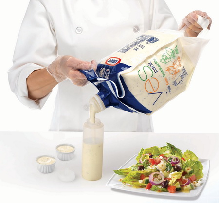
An example, given by Kraft, of utilizing LCA in the United States is their “YES” Pack salad dressing.  The Kraft YES Pack salad dressing team used LCA to prove their design has a reduced environmental impact, because they used 60 percent less plastic packaging than the previous container.

Kraft believes that LCA is a key component in their sustainability journey. Roger Zellner, Sustainability Director for Research, Development & Quality says, “It gives us a competitive advantage, as we now have more insight into how to reduce our products’ footprints, find efficiencies and validate and explain those benefits to customers and consumers. Together, we’re focusing and working smarter and communicating better, which is good for the environment, people and our business.” (Source)


Read More

When you think of a food being hot, where does your mind go? Red for spicy? or flames for heat? How about both?

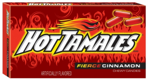
Just Born Inc. has just refreshed one of their most successful candies (and my personal favorite) Hot Tamales and  they did a little of both. The cinnamon flavored candy has heat to it as their new box clearly conveys! The fierce redesign retains the traditional Hot Tamales fireball, making them easily identifiable to consumers in retail, but now with bold new flames to highlight the heat within. The carton itself features a more sultry background in a darker red, which puts more emphasis on the new flames in a bright red. Overall there is more of an eye-catching appearance and the “hot” message is clearly identified wouldn’t you say? Last but not least, to finish off the new packaging the word “Fierce” has been added as a descriptor for cinnamon. The progression of colors used within the word fierce convey how the candy’s spicy flavor rises upon consumption.


What do you think?

Read More

And in with the new. Yet another big brand has re-vamped its look to keep up with the ever changing ways of pop culture.

Seagram’s, best known for their ginger ale, is a subsidiary to Coca-Cola. Like we have said before and shown, Coca Cola is always keeping with the current events and constantly staying fresh–as should other members of their family.


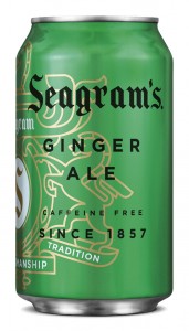
Here’s a look at the old Seagrams.

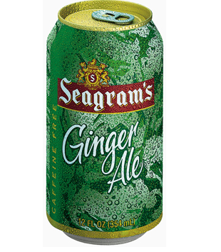
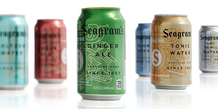
So with any brand, the challenge is how to update such a well know brands without losing some of outs most valuable assets. Take a look at this can. You will notice that the brand has two main iconic elements. The Seagram’s crest and the word mark.


So in the new cans, (right) you will notice that the crest was modernized, in other words it was simplified and reduced to one line weight.  The crest is now more of a friendly element than a crown jewel, with visual treatments such as placing type over it and wrapping it around the corners of cases. It now resembles more of a water mark than a bold crest. At the same time this has allowed the crest to have more of a visual presence and impact that it did not have had before. Notice that in the entire line up–each of the line extension cans have their own crisp, clean metallic versions of the colors consumers associate with the flavors category.

Read More

When it comes to moms and buying items for their children, they want nothing but the best. They want something that they trust, and a quality that they can rely on. Most of the time a mom is accompanied by her children and shopping may not be so easy. Therefore, having a product that is easily recognizable and a repeat purchase would be an ideal scenario.

But in the interest of this blog, lets look at the new package design.

OLD:

04 16 12 gentle2

NEW:

04 16 12 gentle1First, color–a re-vamped teal. This new brand mark communicates pure and mild and is appropriate for display in the baby’s nursery. In addition to the “Gentle Naturals” brand identifier, the words “Baby Therapeutics” were added to the name. Finally, several leaves were incorporated around the “Gentle Naturals” logo to support name recognition.
Something that is becoming more popular because it seems to effective–color coating. In this instance, along with the product descriptor particular colors that speak to each product attribute were worked into the design – Tummy Soother is soft green, Eczema Relief Wash is pink and Eczema Relief Cream is orange. A soft blush was added to all, echoing the color block that gently fades toward the brand mark.

But wait, where did the baby go? Well apparently these packages looked so similar that consumers wound up buying the wrong product! Solution: remove the baby and play up the color coating!

The new design proves clean and with the addition of the “baby bracelet” gives the appeal for parents to set this item out on display as a decorative item–which according to the design team was a key design goal in order to create word of mouth visitors.

Read More

Have you ever thought about drinking a juice box and then instead of throwing it away, eating the box? Well apparently, according to Harvard University professor and biochemical engineer David Edwards, it can be done.

David Edwards invented containers for food and drinks which can be disposed by eating them. “The idea was to try to create a bottle which was based on how nature creates bottles” Edwards explained. The edible containers are made out of so called “WikiCells”, natural food membranes held together by electrostatic forces. Harvard describes WikiCells as “thin delicious membranes with significant water diffusional resistance and adjoined shells that allow for stability of the WikiCells over long periods of time”. (source)

edible packaging 1 Edible Packaging To Help Save The Environment

Edwards thinks that the edible containers will be seen first in restaurants. But the plan is to see them as soon as possible as well in homes and offices, for delivery and purchase in stores. The biodegradable WikiCells can be produced in various sizes and shapes and they can contain solid food as well as liquid.

The idea behind it is to reduce the disposal of plastic, especially in places of the world where the disposal and recycling of plastic still causes human and environmental hazard.

But lets be honest…would you like to go to a restaurant and eat not only the food that you ordered but also the plate it came on? Or would you eat the juice box itself which was shipped from the other side of the country, standing on the supermarket shelf and had been moved and touched by who knows how many people? Of course people are in favor of going green, but would you go this far?


Read More

One of the key issues in packaging today is of course sustainability. Companies are trying hard to put their best feet forward in trying to reduce the amount of waste and be more conscious of what they are putting out there. The material for each package goes a long way from start to finish whether it be plastic, glass, paper, etc. From how its made, to its transportation, to its brand elements, shipping to retail and so on.

When it comes to Planters, sustainability plays a large role in their business today. In order to reduce their impact on the environment, the brand decided that in conjunction with their “Naturally Remarkable” campaign, they too would look into a new package material as well.

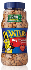
The goal for the company was to reduce the overall weight of its 16 and 20 oz. peanut jars. The challenge of course was to develop a package that was lighter but also would not compromise Planter’s targets for quality, capacity, clarity and shelf life. The agency that Planters used, Sonoco, delivered a durable lightweight plastic option that was actually weighed 84% less than their original glass jars! The significant reduction in packaging materials led to several benefits, including a 25% reduction in the number of trucks required to transport Planters Dry Roasted Peanuts. The best part, Planters new plastic packaging is 100% recyclable and BPA-free!

Read More

On the W we always talk about big brands and big changes. What about the in-house brands or smaller mom and pop shops? Today, we are featuring a private label package re-design from Publix.

Not only did they re-design their package, they thought ahead and made an entire system for their products. This system provides consistency and reinforces their brand. For their candy in particular, their approach here gives consumers what they want–simple, cut to the chase packaging but in a playful yet simple way AND a window to see the actual product.

Personally, I think that the use of color is awesome. I love the fact that the product windows are of a different shape depending on the item. Although each package is not identical, through their use of identical logo placement, color blocks and fonts there is enough brand awareness. It goes to show you that just because it is a store brand, doesn’t mean they were skimping when it came to design!

StripySweets New

Sour Worms


Read More

In case you didn’t see our Facebook post, this year’s Color of the Year is Pantone Tangerine Tango.
Since the release of the color, Pantone has teamed up with SEPHORA to create a collection that they hope will change the way people wear, feel and think about color. Launching this Spring, SEPHORA + PANTONE UNIVERSE™ delivers insightful color forecasting, timely trends and power seasonal product collections.

Check out this video:

Check out some of the products that were created:
03 21 12 pantone


Read More

Even though we normally talk about design on this blog, we of course are always paying attention to new trends and new innovation. Although this may have been premiered a few months back, I found the need to share this new product called YUPOClear.

If you are in the design or packaging field, you know how important color matching is to your brand and its identity. You can say that your brand color is blue–but as we all know the number of blues out there are endless. This new technology is designed to provide a no-label look with the convenience of pressure-sensitive labeling. The ultra-clear label stock eliminates bottle-to-label color matching for colored and opaque packages, and it is 100% recyclable.

YUPOClear Attributes:
YUPOClear possesses the attributes that designers, brand managers and manufacturers require for extraordinary results:

  • Eliminates bottle to color matching – always exact resin color allowing your brands true colors to show through
  • Allows for multi-color bottle creation – not possible before
  • Increased label size possibilities – more space for brand message
  • More control over your visual design language
  • Like all other IML options, YUPO Clear reduces cost compared to other decoration methods

YUPO For Bottle Labels and Packaging

Read More